


There are tons of different touchpoints along the customer journey, and each of these touchpoints can be optimized to increase conversions. However, if you want to get a quick boost in conversions, you should start at the points closest to conversion—AKA your checkout process.
When visitors get to this point in their customer journey, they’re ready to buy—they’ve reached the bottom of the funnel (BOFU). Now, you just have to make small optimizations to encourage them to click “Complete Purchase.”
Here is a list of BOFU optimizations you can make to quickly improve your conversion rate.
1. Pricing
Price is the last thing customers see before clicking “Add to Cart,” which makes it the perfect opportunity for a BOFU optimization.
When it comes to setting prices, there are a lot of different approaches. You can simply match the price point of your competitors, set your price lower to create the perception of the affordable option, or set your price high to establish yourself as the premium product in your market.
But have you ever considered creating a variable pricing structure that changes according to geolocation? For example, you can set different prices for different countries and currencies. You may find that higher prices work better in certain countries and lower prices convert better in other countries.
Depending on your website host or eCommerce partner, you can automatically update pricing on the checkout page, the cart, the order preview, and your entire shop based on the visitor’s geolocation.
Your prices don’t have to be set in stone at the product launch. You can continually optimize your product prices until you’ve found your sweet spot in each of your markets.
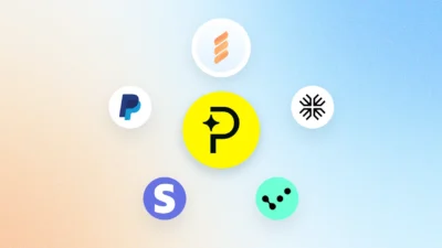
2. Payment options
People like choices, so add more payment methods to your checkout. This is especially important if you sell internationally. And with an ecommerce partner like FastSpring, the process of adding more payment options is super simple and provides a seamless shopping experience for customers across the globe.
For example, you can give customers the option to pay with:
- PayPal
- Amazon Pay
And support credit card brands like:
- Visa
- Discover
- MasterCard
- American Express
- JCB
By adding as many payment methods as possible, you make completing a purchase that much easier for your customers.
3. Subscription tiers
Speaking of options, allow your customers to choose how much of your product they’d like to pay for at one time. If you usually give your customers monthly access to your products/services, give them the option of a 3-, 6-, or 12-month subscription. This makes life easier for your customers by minimizing the number of times they have to renew their purchase. It also simplifies your life by decreasing the number of transactions while increasing your average revenue per transaction.
4. Free trial
For all those customers who are still on the fence as they near the bottom of the funnel, a free trial may be your golden ticket. While nobody likes to give things away for free, this approach gives you the chance to acquire customers you may not have converted otherwise.
What’s nice about a free trial is that you can give your trial customers access to all your product features for limited time, knowing that if they actually use your product during the trial period, they’ll be totally hooked. And once their trial is over, they’ll have to purchase the full product because they can’t live without it.
If you’re not totally on board with a free trial, you can try offering a free version of your product/service. The trick with free versions is deciding what features to make available and which features are only available in your premium version. You want to give free customers enough access to get a feel for the product while leaving them wanting more. So, you have to make sure your best product features are only available with the paid versions.
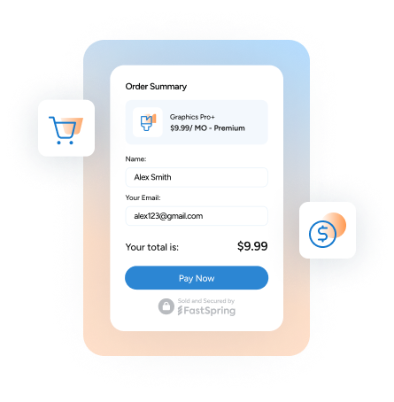
5. Checkout design
The design of your checkout and confirmation pages is critical. You have to ensure your design follows the right eye path, that your fonts and colors are appealing, and that the overall look of your purchase pages doesn’t detract from the purpose of the page.
The nice thing about having an eCommerce partner is that they have templates you can use for your checkout page, cart, and confirmation pages. They’ve done the hard part for you and tested endless aspects of each page to find what converts and what doesn’t. All you have to do is plug in your branding and watch the sales roll in.
Now, you just have to worry about what template works best for your products and customers. Try AB testing a few different templates to see which one brings in the most conversions.
Need a little inspiration for your checkout? Take a look at checkout examples from real FastSpring customers.
6. Form process
From the number of fields included in your form, to the order in which you ask questions, to how your questions are worded, there are a million different ways to create a form.
Depending on your product and market, your customers may be fine with a long forms that include a ton of questions. On the other hand, your customers may be turned off if a form that has more than two stages.
Again, with an eCommerce partner, you can customize exactly how you want your form to look and function. Just test different forms and see which one your customers prefer.
7. Checkout copy
Copy is so important. You constantly have to ask yourself, “What’s our voice?” “How much copy do we include on a page?” “What should this button say?” Every word makes a difference when it comes to conversions.
Copywriter Amy Porterfield said, “I knew that copy was the lifeblood of any business and when you know what to say and how to say it, you instantly connect with your audience. Copy creates connection and connection creates conversions.”
As you optimize copy closer to the bottom of the marketing funnel, your tone and focus has to change. It becomes less about educational content and more about product-specific and a “show don’t tell” type of speech. This is the perfect place to feature case studies, customer testimonials, product walk-throughs, live demonstrations webinars, and consultations.
But remember, as you optimize BOFU content, start at the points closest to conversion. For example, test your button copy. Then move to your form heading and subhead. Then test the page heading of your checkout page. After that, you can look at optimizing your body copy. Now, apply that approach to every BOFU page.
Optimizing at the bottom of the funnel is truly an art. There are so many different things to test and points of contact to consider. But there’s nothing better than when you start seeing those tiny alterations make a big difference in your bottom line.