When was the last time you took a close look at the checkout experience on your website?
If you haven’t thought about how website visitors purchase your software or digital products, then you’re glossing over a key aspect of the overall customer experience. And if you’re not focusing on the checkout on your website, you’re likely losing out on revenue—more on that later.
Keep reading to learn:
- Why the checkout experience matters
- How we’re helping software companies increase sales with branded checkouts
- Where you can find inspiration for creating your own great checkout experience
You Can’t Afford to Ignore the Checkout Experience on Your Website
Did you know that 23% of site visitors abandon their cart due to a long and/or complicated checkout process?
Let’s do a little math.
Let’s say your website generates ten thousand visitors per month. On average, about half of those visitors are simply browsing without any intention to buy. So that leaves about five thousand visitors that you could potentially turn into loyal customers.
If you’re turning away 23% of the five thousand interested visitors due to an outdated or overly complex checkout experience, that’s 1,150 customers you miss out on each month. Totaling to over 13,000 lost visitors each year.
If you’re charging $100 for your digital product that translates into over a million dollars of revenue that you’re losing each year due to a poor checkout experience!
What are Branded Checkouts and how do they work?
Are you still redirecting to a third-party hosted checkout page or forcing your site visitors to jump through infinite hoops to create an account before they can make a purchase?
What if I told you there’s a better way?
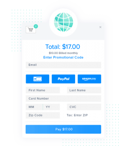
When you partner with FastSpring, you have the ability to reduce cart abandonment with our Branded Checkouts.
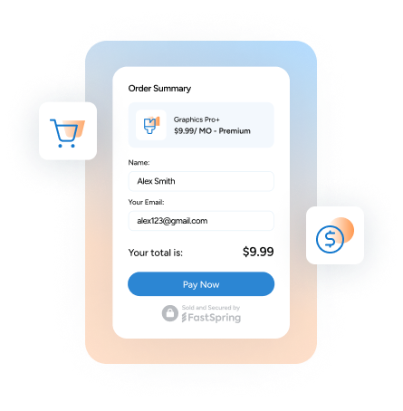
Whether you’re selling digital products, subscriptions, or software, our Branded Checkouts are completely customizable and designed to help you easily create streamlined and modern checkout experiences your customers will love.
Customer Growth Story: When Capture One partnered with FastSpring, they were able to expand into new global markets with localized checkout experiences that automatically display accurate pricing, language, currency, and taxes — which increased their conversion rate by 40%! Click here to learn more about Capture One’s success with FastSpring. Click here to learn more about Capture One’s success with FastSpring.
Customize Your Branded Checkout with FastSpring’s Store Builder Library
One of the things that makes FastSpring unique is our Store Builder Library.
When you partner with FastSpring, you can use the Store Builder Library to create, implement, and customize a dynamic popup storefront that allows your site visitors to purchase your digital products directly from the product page on your website.
With just two lines of code embedded on your website you can:
- Customize your checkout to seamlessly blend with your unique brand
- Update your store and products in real-time
- Offer localized checkout experiences
- Maximize your revenue potential with data-driven insights
Introducing the FastSpring Checkout Examples Page
With FastSpring, the options to customize your checkout experience are practically limitless. And we understand that can that be pretty overwhelming especially when you have so many other aspects of your business that you need to worry about.
This is why we created the FastSpring Checkout Examples Page!

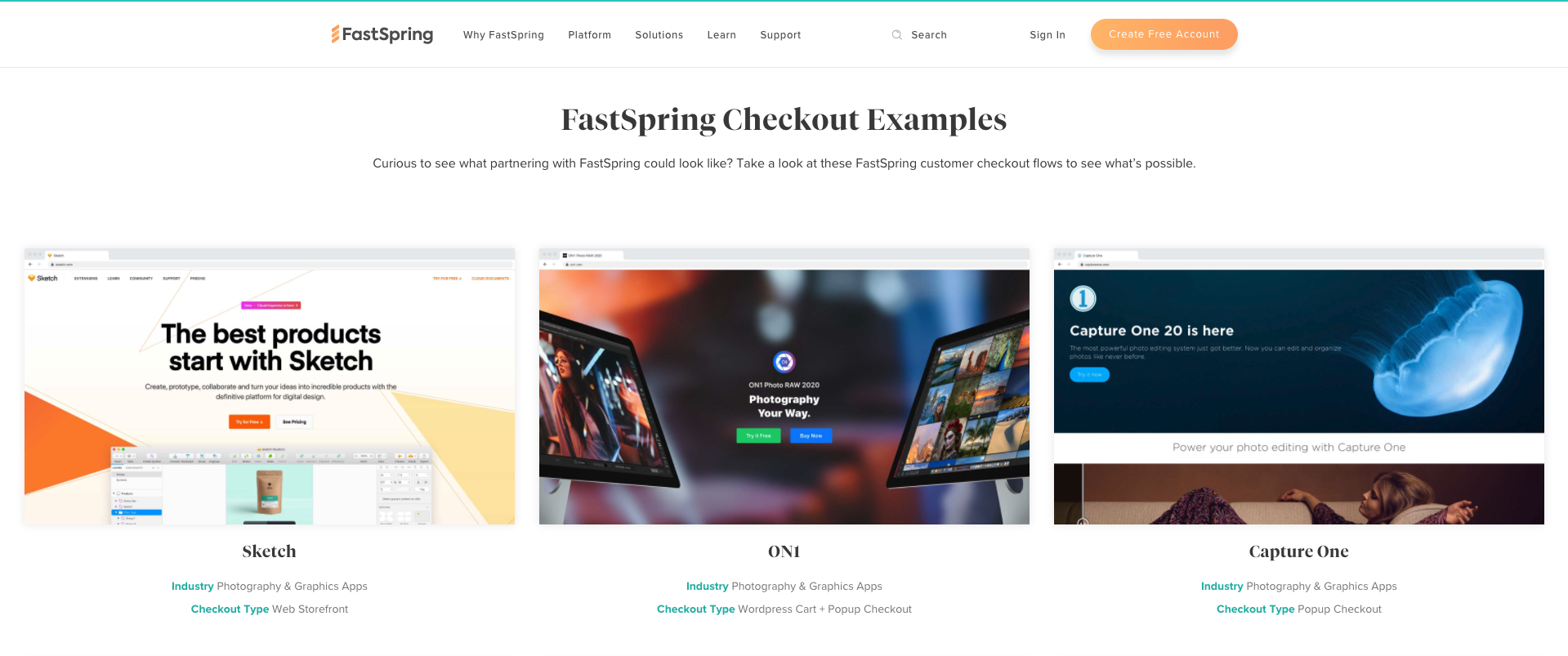
The FastSpring Checkout Examples page is your go-to resource for inspiration for your own checkout flow. This page features examples from real Fastspring customers. You can browse checkout flows from a variety of companies like Sketch, On1, and Capture One.
Are you ready to build your own branded checkout and start driving 30% more revenue? Create a free FastSpring account today!


