Today we’re giving customers early access to our new Reseller store experience. It’s faster, easier to use, and has a modern look designed to make it easy to manage Resellers while still keeping all the elements that you love about the current experience.
We’ve received lots of great feedback from many of you on areas we can further develop, and potentially introduce new features for our Reseller solution. So this year, we’re starting with launching our updated interface and will follow that up with new features and enhancements to our platform based on your feedback.
What’s changing?
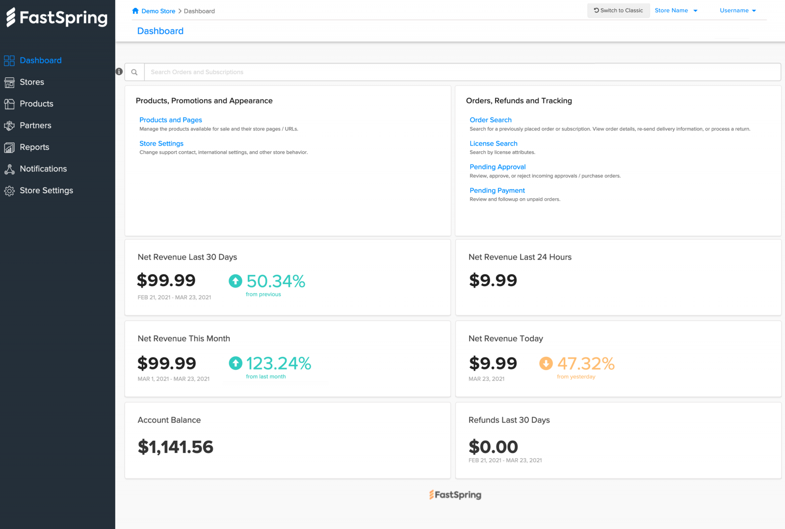
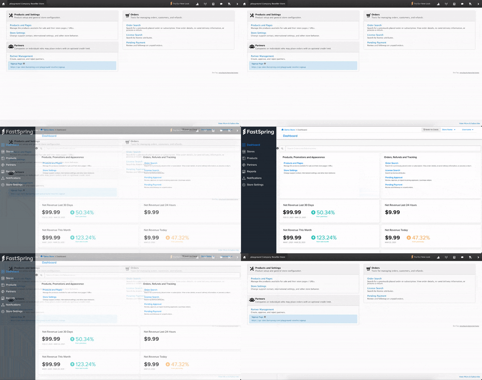
Today’s update gives you access to the new layout. We simplified the toolbar and introduced tabs in the column running down the left-hand edge. It’s a clean, minimal look that feels more modern and visually appealing – much like the new FastSpring App.
- Redesigned order page
- Updated dashboard with more reports
- Improved navigation
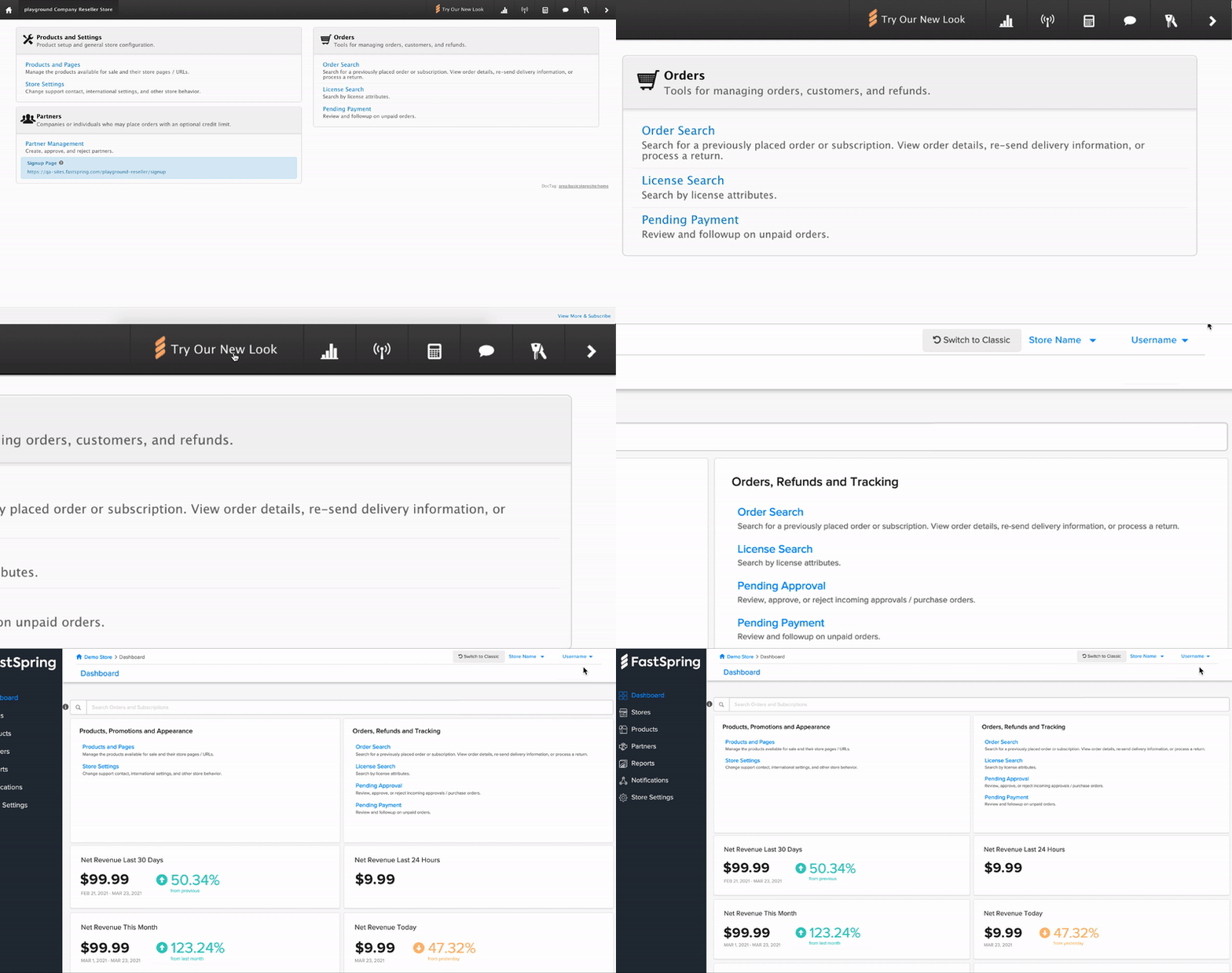
To test it out, all you have to do is click on “Try Our New Look” and you will automatically be redirected to the new interface. Early access to this interface is optional, so you can always switch back to the Classic view if you prefer the older look.
Navigation Changes
You can now access the full menu on the left side of each page in the FastSpring App. We’ve also added a three-tier breadcrumb system that helps you keep track of your place within the App and return to a previous page. In the breadcrumb navigation, click the hyperlink of the page to which you want to return.
Dashboard
Your new Dashboard includes all of the options you’re used to from the old look, but it now comes with new reporting/analytics widgets that feature real-time revenue trends and provide insight into the performance of your Reseller Store.
Reports
In addition to the reporting widgets in the dashboard, you’ll also have access to a new Reports menu on the left-hand side of the FastSpring app. FastSpring proves a few different reports designed to meet different needs. Start with the task you are looking to perform and use sub-categories in the menu to identify the best report.
Partners
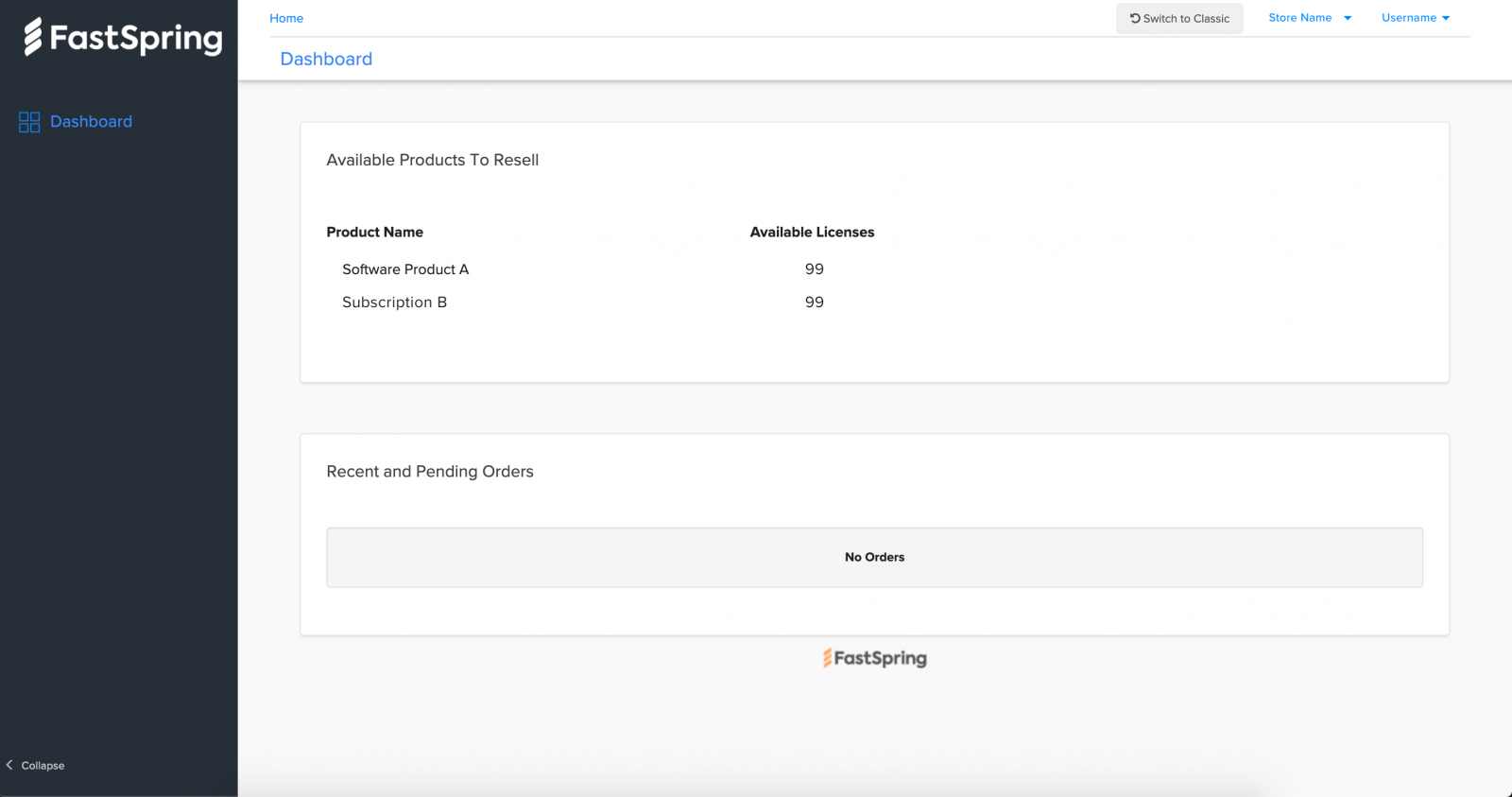
Last but not least, your partners will also have access to an updated portal experience as well. This means your partners will also be able to access the new reporting features in addition to everything Reseller Partners can already do in the old interface:
- Self-service the management of orders, assigned licenses, and unassigned licenses
- Receive immediate access to licenses when a credit limit is in place.
- Minimize data entry when placing new orders because most of the information is on file.
- Have multiple users manage the orders and licenses of a single organization’s partner account.
Why are we changing the look?
You probably haven’t seen any updates to your Reseller Store in a long time. Why is that? Well, the Reseller experience currently sits in the older, legacy side of our software (Classic). Recently, we’ve been laser-focused on bulking up our new platform, but we’ve heard your feedback and know you want more out of a reseller management tool.
In order to start enhancing your toolkit with the features you need the most, we’ll be moving the reseller experience to the new version of the FastSpring App.
Help us design your new Reseller experience
Test drive the new look and tell us what works, what doesn’t, and what features you need the most. All the comments you share will guide our roadmap and shape what we build.
Just like we partner with you to improve conversions, we’re going to partner with you to build a reseller management tool designed for your needs.
Here are some areas where we’d love your feedback:
- Where do we slow you down or speed you up?
- How can we help you find partner features more easily?
- What partner features are missing?
- If you could change one thing about the Reseller Store, what would you change?
- What are your aspirations for your future partner program?
- If applicable, what is bringing you back to the legacy site?
How to tell your reseller (partners) about the change
Communicating product changes is an important aspect of the relationship between sellers and resellers. This is especially true if it impacts how they manage their business, track orders, and use the software on a day-to-day basis.
But it can feel intimidating if you don’t know what to say.
We’ve put together this sample message you can use to announce the new UI/UX changes and communicate why things are changing:
“We’re excited to announce that we’re partnering with FastSpring to enhance your Reseller experience. Today, you’re getting early access to a new design of our partner portal designed to make it easier to manage and track your sales.
Why the change?
This update is the first step in a larger plan designed to give you new features and functionality. We’re still working on making this experience better so we’d love your feedback.
To access the new updated interface simply click on ‘Try Our New Look’ and you will automatically be redirected to the new interface. Don’t worry, early access to this new experience is optional and you can switch back to the Classic view with a click of a button at the top of your screen.”


