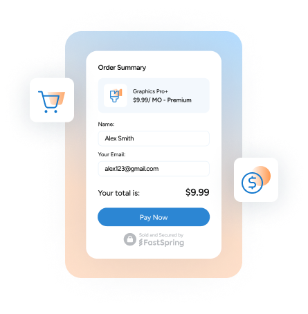
As an ecommerce business, the most important part of your store is your checkout. The checkout process is your “make it or break it” moment that will either convince your customer to click “buy” or leave your store altogether.
Sadly, an average of 68.07% of online shopping carts are left abandoned, leaving merchants across the globe with billions of dollars in lost sales. It’s enough to leave online sellers tearing their hair out wondering how they can have so much web traffic yet so many abandoned carts.
What went wrong?
Unfortunately, attracting buyers to your ecommerce store is not as simple as the “if you build it, they will come” approach in Field of Dreams. Because, even though making a baseball diamond in a cornfield was enough to attract old baseball player ghosts for Kevin Costner, making an ecommerce store itself isn’t enough to attract buyers.
Sorry Kevin.
People will come, but they aren’t guaranteed to buy. In order to turn visitors into paying customers, you don’t just have to build it, but you also have to maximize the checkout experience.
Instead of focusing on what you might be doing wrong, let’s instead focus on what other sites are doing right.
5 Things That Top Sites Do Better In Their Checkout
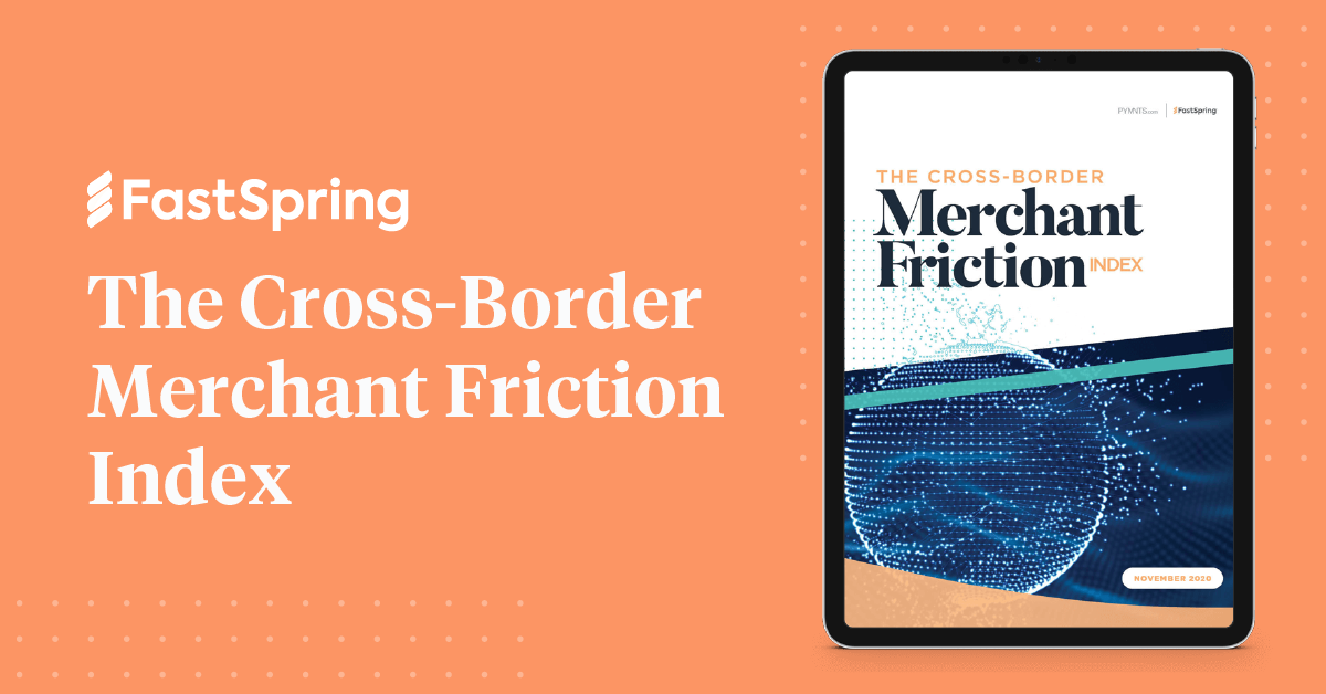
According to PYMNTS recent report in partnership with FastSpring, The Cross-Border Merchant Friction Index, which analyzes key friction points experienced worldwide by consumers, the most successful sites with the least amount of cart abandonment check the following boxes:
1. They Keep Things Quick
People respond to the least amount of friction possible when checking out. Why make your customers jump through a variety of unnecessary hoops only to lose their interest?
Keep it short and sweet.
If there’s one thing you do to improve your customers’ checkout experience, make it limiting the amount of effort required of them to check out.
Keep your click count down, and you’ll watch your cart abandonment go down with it.
2. Make It Mobile Friendly
The bottom line is that if you plan on your ecommerce site being successful, you need to cater to mobile users. With over half of website traffic coming from mobile phones, failing to optimize your site for mobile users would be ignoring a huge portion of potential customers.
Making your website mobile-friendly means doing things like:
- Intuitively adapting to whatever device your site is being accessed from.
- Ensuring that all links and buttons are appropriately sized and margined to avoid clicking errors
- Ensuring any customer service phone numbers are text rather than an image so that users can easily copy and paste.
- Making information easily readable on a small screen
3. Cater To International Customers
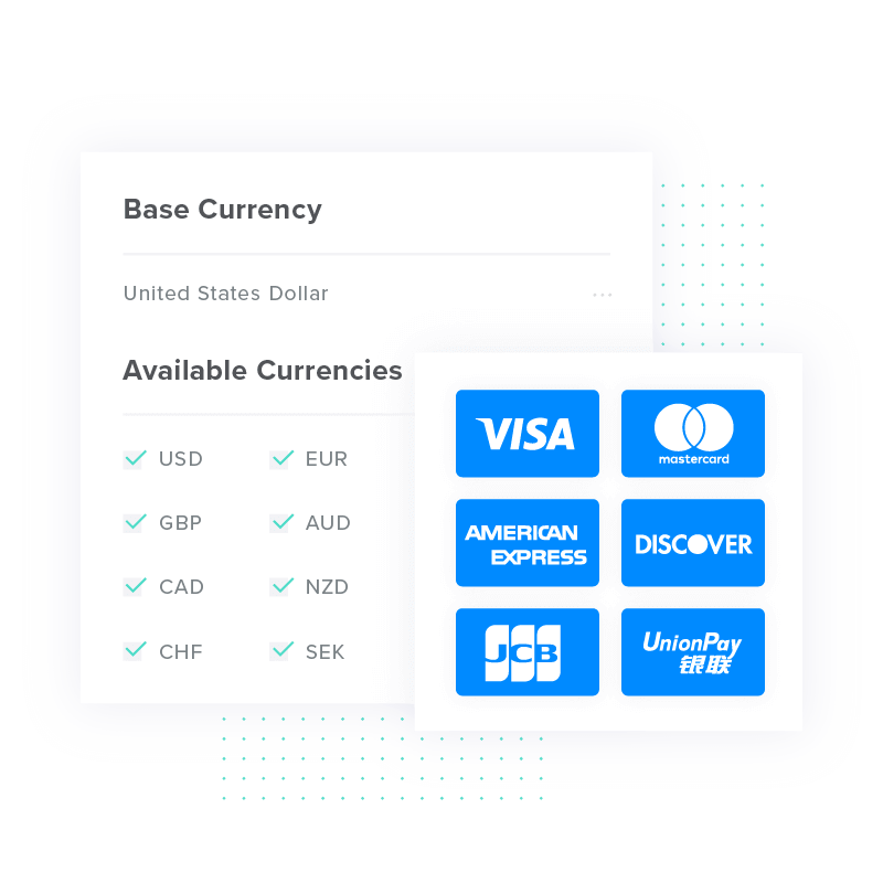
The PYMNTS Cross-Border Merchant Friction Index suggests supporting at least seven languages as well as accepting at least 16 currencies.
Consider making use of IP recognition technology so that your site automatically adjusts language and currency settings, providing a localized experience.
4. Give Customers The Options To Make a Profile
Forcing your customers to create a profile to make a purchase often results in cart abandonment. Remember, the least amount of steps required of your customers, the better.
Yet, many online shoppers appreciate the option of creating a profile, so their information is easily stored for their next purchase. Data shows that websites that don’t require their customers to create a profile before purchasing perform considerably better than those that do.
5. Provide a Clear Refund Policy
People want to know that the site they’re buying from is trustworthy. When shoppers don’t see a refund policy clearly stated, they’re much more likely to hesitate. Give your customers confidence in your store by clearly displaying your return policy at checkout.
Here is a perfect example from Adobe’s subscription checkout, where their refund policy and customer support information is prominently displayed on the bottom.
Reap The Benefits of a Smooth Checkout Experience
While some abandoned carts are out of your control, there is a great deal that is well within your reach. By making your checkout process as smooth as butter, you won’t just create happier customers but also boost your revenue. Ready to level-up your checkout? See how FastSpring can help!
Want to learn more about optimizing your checkout for global sales? Get your copy of The Cross-Border Merchant Friction Index by clicking the image below!


