

We live in a world run by data. We use massive amounts of data to tell the story of the world around us.
This is especially true for software companies. It is an essential ingredient in understanding the health of a business. However, many businesses struggle to make sense of the massive influx of numbers, percentages, and other data points. Many ask themselves—what is the story that the data is showing? How can we use the data to understand our business and make decisions that help us grow? How can we build out a strategy or develop new products that will have a positive impact on our future? What is working? What’s not working?
Simply pulling the numbers together isn’t enough. It can quickly become confusing and overwhelming with the potential for misunderstandings.
Since numbers are only telling part of the story, the best way to make sure the information is clear to all stakeholders is to collect the data from all your sources and adapt it to a more visual-friendly medium.
The good news is, you don’t need a massive team of data scientists to make visual data possible. Thanks to Google, you can now create highly engaging reports that all stakeholders can understand with Google Data Studio (GDS).
What is Google Data Studio
GDS is a component of the Google Analytics 360 Suite. It is Google’s free data visualization and business intelligence (BI) product that lets you connect and report on data from hundreds of data sources. You can easily connect a Google Data Studio dashboard to pull in Google Ads spend, YouTube traffic, and everything you’ve set up in Google Analytics (goals, segments, and traffic sources).
For software companies selling online, GDS can provide insights into both search engine optimization (SEO) and powerful ecommerce metrics. This enables you to track everything from your best referrers to average order values all in a single place. These are powerful data points that can make a real difference in maximizing revenue when selling digital products online.
Google Data Studio can help you discover answers like:
- When do customers abandon their carts?
- What product pages have lower-than-average conversion rates?
- What marketing channels perform the best?
Answering these valuable questions helps you understand where simple changes and investments can help lead to improved conversion rates. For example, you might find that customers abandon their cart after they’re prompted to create an account to checkout. This may lead you to test offering a guest checkout option. Doing so, you might discover that simple change dramatically increases your conversion rate and, by extension, accelerates your revenue growth.
These are just a few examples of how GDS enables you to surface ecommerce analytics data into easy-to-understand dashboards through data visualization.
Getting Started
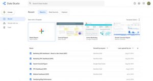
When you open Data Studio for the first time, you see a report that gives you a tour via an interactive dashboard that shows you around the interface.
I recommend starting at ground level and playing around with the tool. The more you play, the better the questions you’ll start asking. Even if you’re not technical or you’re not a numbers person, Google Data Studio is an intuitive tool and easy to learn.
However, don’t expect to spend all day creating the perfect dashboard. The dashboard you need right now gives you the answers that you want right now. As you continue interacting with your dashboard, you’ll begin asking more advanced questions that require more advanced customizations.
For dashboards that analyze data from Google, the built-in templates are a good place to start. You can find a PPC Ecommerce overview template, a YouTube channel report template, plus a search console template, and more. These templates are also a great way to figure out how to build a report and see the connectors used. You can see how the templates combine visualizations and figure out how the dashboard shows a result.
Dashboards / Reports
The dashboards created in Google Data Studio are easy to understand and customizable, giving you the flexibility to select how you want to present the data — charts, bar/line graphs and so on. It even makes it easy for you to brand your dashboard by changing fonts, colors, and even adding your company logo.
The process of creating an ecommerce dashboard is relatively straightforward, but selecting the appropriate metrics and layout is a much more challenging task. While some of these choices may depend on your specific business model, there are some broad metrics and layouts that apply to all digital product businesses.
I recommend focusing on high-value metrics like:
- Checkout Funnel Metrics
- Average Order Value (AOV)
- Conversion Rate
- Revenue per User
- Cost Per Acquisition (CPA)
- Return on Ad Spend (ROAS)
These data points can help you understand more about your visitors’ shopping behavior. By analyzing high-performing products you can see what’s working and apply the techniques to underperforming products to improve them.
Creating Your Layout
Crafting the right layout for your metrics is very important. You need to make sure that the data is presented in a way that produces meaningful insights and provides context into your dashboards story. For example, the current conversion rate is good to know, but showing a trend over time can be more impactful. You may also want to know what referrers are the most valuable in order to focus your efforts on those channels rather than broadly targeting audiences.
Suggested Data Studio reports could include:
- Top Selling Products
- User Segments and Demographics by Conversion Rate
- Revenue Trends by Geography, Device or Gender
- Conversion Rates by Source/Medium
Additionally, your dashboards are shareable, it often makes sense to style the dashboard properly and provide descriptions of each data point. Failing to provide good documentation has a chance to make the dashboard less valuable – even if the insights are obvious to you.
The Bottom Line
Google Data Studio helps make raw analytics data a lot easier to understand for digital marketing professionals. With Google Analytics and Enhanced Ecommerce data alone, you can gain a lot of insight into how your products are performing, as well as what marketing channels and search queries are worth doubling down on.
Here at FastSpring, we’re focused on helping our sellers increase revenue by 30% or more with our Full-Service Ecommerce platform. If you’re interested in learning more, schedule a demo today!