The following article is a guest post written by Tony Minh Do, Marketing Manager at HubSpot.
One of the most important parts of your store is the checkout page. Working with a website checkout page that will convert more visitors will help you increase sales. Knowing what to track and how to meet your guests’ concerns proactively is even better.
And that’s what we’ll go over today. Here’s what you’ll learn:
What Is a Checkout Page?
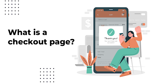
The checkout page is the second to last page your visitors see in their shopping journey. It’s also the last step before they commit to making a purchase.
Cart abandonment and second-guessing can be big issues here, so you want to take steps to encourage customers to continue.
The best way to do so is by reassuring customers. Provide confirmation on the following information on your checkout page:
- The customer’s information
- Shipping details
- Billing details
- Order number for tracking
- Price and payment information
By providing that information in an easy, clear-to-read format, customers can verify the information they need to continue with their purchase.
In most cases, you’ll want a one-page checkout to make customers feel at ease. The number of pages can, however, vary based on product type. Just make sure the submit payment button is easy to find at the journey’s end.
Why Checkout Pages Should Be Optimized
Optimizing your checkout page helps provide a seamless checkout experience. It concludes the customer’s purchasing journey and helps you continue to build trust. Therefore, you want to create high expectations for your customers and meet them.
Not doing so could be costing you sales. The average cart abandonment rate is roughly 69.82% across all industries.
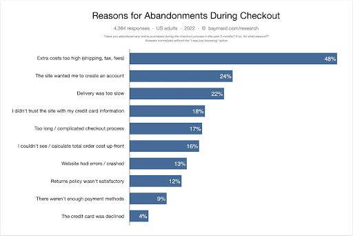
Moreover, research from the Baymard Institute on cart abandonment found that many reasons a customer doesn’t complete their purchase are also related to the checkout page. 17% of respondents said the process was too long or complicated, and 16% said they couldn’t calculate the total cost upfront before purchasing.
In contrast, optimized website checkout pages offer a streamlined checkout experience that addresses customer concerns and improves conversions.
It’s important that each step of the checkout process is logical and doesn’t waste the customer’s time. For instance, a simple change such as going from separate first and last name form fields to a single full name option could help.
Also, you shouldn’t add new, weird fees or last-minute charges that differ from your product pages. That catches customers by surprise and deters them from making purchases.
Other design steps can help optimize your website checkout page too. For example, are you taking advantage of white space? Is your call to action (CTA) above the fold?
And more importantly, does your checkout process flow well in mobile and desktop design?
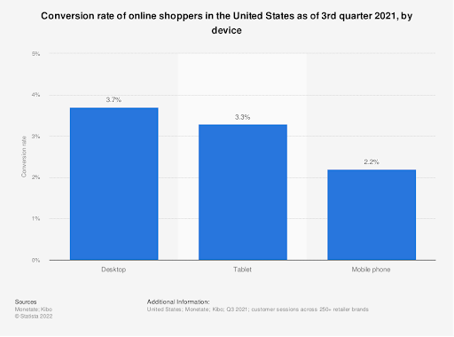
Barilliance found that 85.65% of mobile device shopping carts were abandoned compared to 73.07% of desktop carts. As more traffic comes from mobile, you need to ensure their experience is great, regardless of screen size.
At the end of the day, if your design is too complicated, customers will abandon their carts. The easier and more attractive the checkout process is, the more likely you are to convert these visitors into customers.
What KPIs Should You Track When Creating a Checkout Page
You can see how your checkout page performs by tracking the right KPIs. While these can’t always answer every question, they should help you identify what you should change about your website checkout page or user experience.
Just remember to be skeptical about your metrics by double-checking these numbers when possible.
That said, here are some metrics worth tracking:
- Shopping cart abandonment rate: If this is high, something is probably wrong or confusing with your checkout flow. Try comparing to others in your industry as well.
- Conversion rate: The higher your conversion rate, the better. SaaS companies might need to be aware of their unique challenges when calculating this.
- Cost of customer acquisition: Represents the effectiveness of your marketing efforts. The worst thing is if this is more than the value a customer brings in.
- Customer lifetime value: How much does the average customer spend overall throughout their relationship with your company.
- Average customer order value: How much does the average customer spend per order.
- Average duration on page: How long did check out take?
5 Checkout Page Templates and Examples
Now that we’ve gone over the basics of checkout pages and why you want to optimize them, here are a few examples to give you a visual idea of what to aim for.
These checkout page templates are simple, clear, and provide the information customers need to complete their purchases.
1. Photobucket
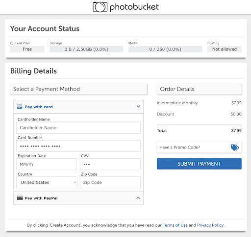
Photobucket is an online photo storage service for users who need extra cloud-based storage. Its checkout page template is simple, with only the necessary form fields shown.
Pricing is clear, and it’s easy for users to know which payment method they’ve selected and when their payment will be processed. The whole thing has been simplified into only a few clicks, which helps reduce cart abandonment.
2. Sketch
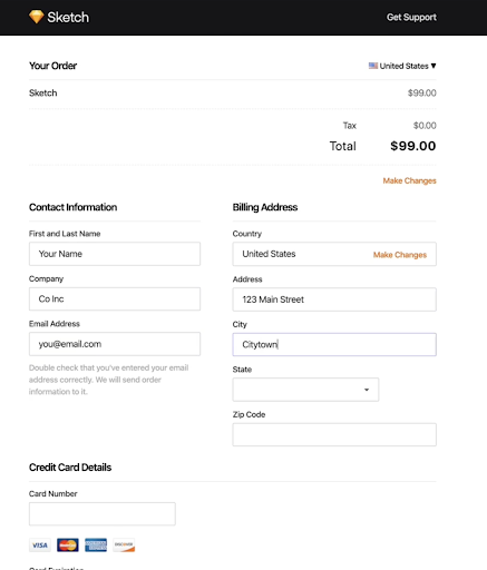
Sketch is a UX design-focused SaaS company. While most of its website is full of bright colors, videos, and eye-catching graphics, its checkout page design is deceptively simple.
Sketch asks for only the necessary information and shows the pricing at the top and bottom of the checkout page. Everything is in black and white. Only a few details like credit card logos offer a dash of color.
3. Adobe
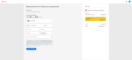
One of the most famous design software companies worldwide, Adobe also has one of the easiest checkout pages to complete. It highlights the savings you can take advantage of while making it easy to tell how much your total is.
The payment forms are easy and allow for many different choices. Lastly, Adobe has a bright blue CTA asking you to complete your purchase.
4. FreshBooks
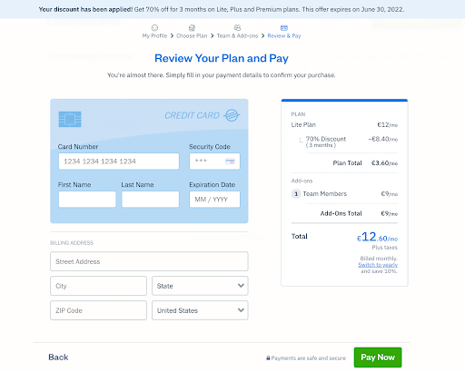
Freshbooks accounting software offers a fun twist on the website checkout page. FreshBooks has a bit more color than many other brands on its website checkout page, but it uses it effectively.
The credit card-shaped payment form fields are a fun touch, especially for a financial platform. Besides blue, they offer a contrasting pay now CTA and easy-to-understand pricing.
5. HubSpot
Last but not least is HubSpot, the CRM software company. HubSpot also uses minimal colors, a simple layout, and easy-to-read forms. The checkout design is similar to the rest of its website, keeping everything on brand.
Pricing is clear, but if users have any questions, they can use the chat option right on the screen.
How To Use FastSpring for Your Online Checkout
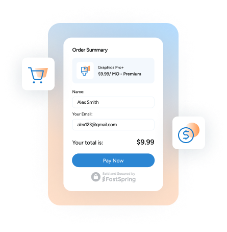
FastSpring offers a modern, intuitive, branded checkout experience that drives conversions, improves revenue, and reduces cart abandonment. These layouts are great for straightforward pricing, but things can get complicated when your company offers quote-based pricing.
In cases like these, you might want to look for solutions like FastSpring’s Interactive Quotes (IQ) to help make these custom checkout options easy for customers. For example, you can integrate FastSpring IQ with HubSpot CRM to populate interactive quotes easily.
FastSpring’s Interactive Quotes (IQ) add end-user-adjustable sliders and checkboxes that allow prospects to update options and pricing in real-time to suit their needs. The changes are easy to track and make understanding your quotes simple, making it easy to align on pricing.
What To Do Post-Checkout?
After optimizing your website checkout page, it’s time to work on the post-checkout process. That may involve the following:
Send a Confirmation Email
Email is important for every stage of marketing your product, even if web visitors don’t complete the purchase. Barilliance found that 15.22% of cart abandonment emails were opened in 2021, helping businesses close even more sales.
You can also send a confirmation email after the checkout process is complete. That way, the customer can feel secure their transaction went through. Some email services automatically send these emails with all of the details from your checkout page.
That includes:
- Order number
- Order details
- Cost
- Name
- Other important information
Templatize Your Email
To save time and reduce the chance of errors, create a few email templates you can reuse. These also work great with CTAs to connect with customer support if needed, building continued trust with your customers.
Provide All Communication Methods
Nothing builds trust faster than making it easy to get in touch. Add an email address for customer support, a business phone number, and even consider working in a ticketing system if applicable.
This is also an excellent time to work on some subtle upselling. You want the customer to feel connected, so add social media links and provide a newsletter signup option.
Allow Refunds or Cancellations
Allowing refunds helps improve the customer experience and builds trust between you and the customer. If it’s too difficult to cancel an order, the customer might never want to shop on your site again.
While it can be difficult to lose the sale, the customer will appreciate a frictionless refund policy, and it will reassure them that they can trust you and your website in the future.
They’ll also be more willing to come back if they know refunds are a hassle-free experience.
Provide a Method for Feedback
Post-checkout is a good place to ask for feedback from customers. After all, your brand is fresh on their minds. Create a contact form or survey which allows customers to provide feedback after important touchpoints.
These touchpoints may include times like after a sale, after a refund is issued, or after speaking with a customer service representative. You can learn why the customer chose to ask for a refund or if they found the product satisfactory.
Act on That Feedback
Don’t just let these forms pile up. Make sure all of the data you collect is stored safely. Then use the feedback and the KPIs we mentioned above to continue to improve your website overall and the checkout features you provide.
Final Thoughts: The Best Checkout Page Templates for Your Brand’s Website
While a checkout page template looks simple, there’s a lot of thought into what goes onto each page. You want to provide a last-minute confirmation of the process for your customers, but you don’t want to overwhelm them.
Design trends for checkout pages have continued to veer towards simplicity, making it easy for customers to verify the information without getting distracted by flashy graphics. Additional features like email sign-ups and a refund policy can fit in, but try to keep them in line with the rest of the page.
You want to keep track of how your checkout process flows and get feedback from customers who completed a purchase. An easy way to take care of all of these concerns is to use a service like FastSpring. We take the guesswork out of more complicated sales processes so you can focus on your products.


