One of the biggest challenges for any online business is getting site traffic to convert into revenue. Take a look at these six simple tips to help you guide visitors towards completing a purchase.
#1: Focus on the value prop – “What’s in it for Me?”
At the end of the day, your software solves a problem for your customers. So they need to be able to see right away how your software helps them. Instead of referring to your software in a never-ending list of specs and features, outline the real-world benefits of your SaaS solution. Top-notch customer service? Make sure they know about it. A program that’s going to boost productivity? Detail the ROI potential. Your approach should always be customer-first when it comes to writing about your service.
Take Skylum’s new tool, Luminar 2018, for example. There’s nothing vague about what Luminar can do for its users. They know saving time is important to their audience so they put that front and center in their description of their product.
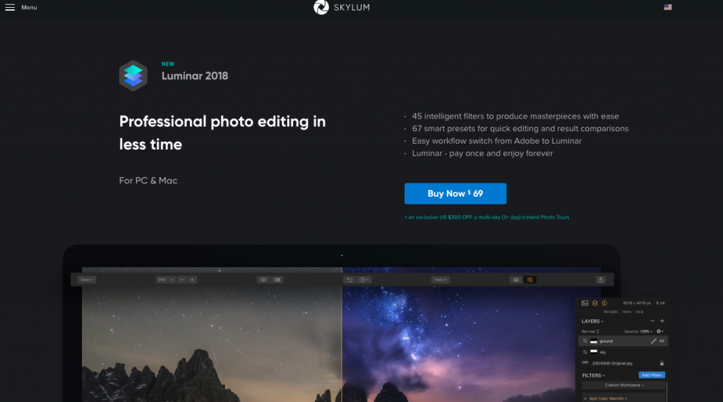
In just a few choice words, Skylum captured the powerful capabilities and time saving benefits its photo editing tool can offer. What more could you want?
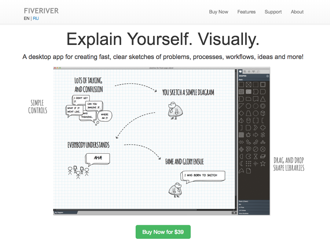
FiveRiver provides another great example of a clear value prop. Tapping into the visual nature of our world, the tagline “Explain Yourself. Visually” works with a sentence-long explanation—still succinct and to the point—and an image of the software to show how it works at a glance.
#2. Let site visitors see it before they buy it.
Your site visitors expect to fully understand what your software entails before they are willing to make a purchase. Remove the mystery with a series of screenshots, gifs, or set up a video demo of what they can expect. Don’t forget to include follow up steps to help them continue their purchase journey. The more questions you can proactively answer for your potential customers, the more confident they are going to feel about your software.
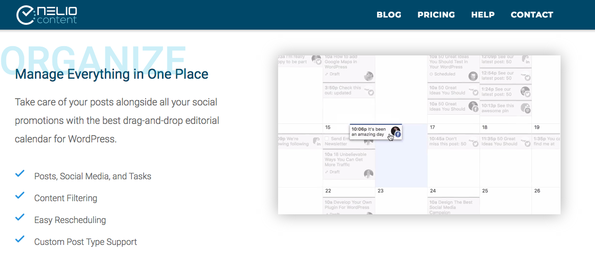
Case in point: Nelio. They feature short videos that work in tandem with clear and concise copy to give a crystal-clear view of the benefits of the editorial content calendar for WordPress.
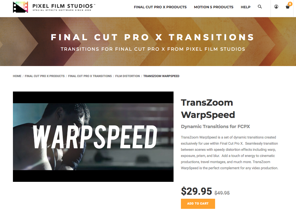
Another great example comes from Pixel Film Studios. They feature a short yet informative video next to a brief product description. The site visitor can quickly learn exactly what to expect from the editing tool, and they can make a purchase right away with the “ADD TO CART” button featured at the bottom of the description.
#3. Offer a free limited trial.
Studies show that on average six in ten free trials convert to paid subscriptions. It makes sense that anyone who is about to make a significant investment in your SaaS solution would prefer to try it before they buy it. A free trial encourages a hands-on experience with your product and allows prospects to “learn the ropes” without fear of losing out on their investment.
Don’t forget to test your limited trials. Play with the length of the trail, see if there is a change when you require a credit card to sign up and try offering full access rather than a limited set of features. And the most important rule of all is to make sure your ecommerce solution is ready to go when your customer is ready to convert to a paid subscription. This includes sending reminder emails before the trial is up so your customer knows when to be prepared to start the billing cycle.
#4. Showcase customer reviews and testimonials.
Back up the stellar benefits your product delivers with customer reviews and testimonials. Testimonials from players in the industry you’re targeting lend credibility to your brand. Not sure how to get started? Simply send a short survey to your customers a few months into their experience. Their responses will not only provide social proof of your solution’s value, but it will also provide actionable feedback to your product and development teams!
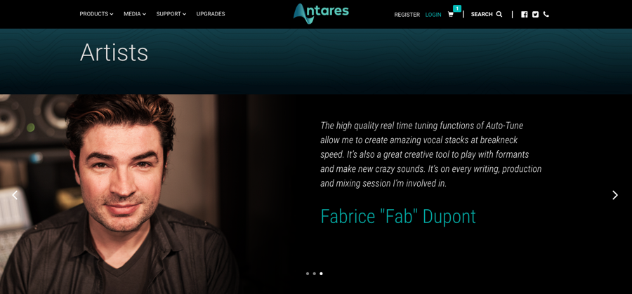
One good example is the way Antares presents their customer testimonials. A music software and plugin company, their website presents artists alongside their quotes. Each testimonial speaks to a specific product that Antares offers, and what makes it so great for the artist’s use case.
#5. Allow them to choose the solution that best fits their needs and budget.
Each customer will have certain needs based on their unique use case. Not everyone is going to perfectly fit in a one size fits all solution. So a great way to accommodate customers of all shapes and sizes is to provide tiered plan options with increasing capabilities and features at each tier that’s associated with an incremental cost. Chances are most will find the middle option “just right” for their needs, so be sure to price and market that option accordingly. This is also a great thing to test—try different prices for each tier, play with the number of tiers offered, and see which tiers perform best.
#6. Offer a consistent line of communication with email.
Whether your customer signed up for a free trial or they’ve been onboarded, it’s crucial to stay in regular communication with them throughout the entire lifecycle. After they’ve signed up, send a personalized “welcome” email, and follow up with a series of automated emails based on their behavior, such as login frequency, milestones, and anniversaries.
It’s important to remember that these tactics aren’t the type of thing you can set and forget. You need to consistently test, analyze, and optimize these tactics to see an impact on your conversion rates.
Happy converting!
