Did you know that the conversion rate for visitors who land directly on a product page is around 7%? That should blow your mind when you consider the conversion for visitors who land on the homepage is only 2-2.5%. That means visitors are 3x more likely to convert if they land directly on your product page. So, I guess your product pages better be on point if you want to get those sweet, sweet conversions.
But ecommerce conversion is a tricky business. Everything from your font choice to the color of your “Buy Now” button has the potential to influence your conversion rate. But we’ll let the conversion specialists worry about testing the millions of different variations. We want to talk about the essential elements that every successful product page needs to increase conversions.
1. Visuals
Whoever said “Don’t judge a book by its cover” clearly wasn’t a photographer or graphic designer. When someone lands on your product page, you only have a few seconds to catch their attention before they bounce. So, you want the first thing they see to be an eye-catching image or video. Push the product description below the fold and let your visuals do the talking first.
Be sure to include several HD images of just your product along with images that show your product in context.
Snagit Example:
Why we love it
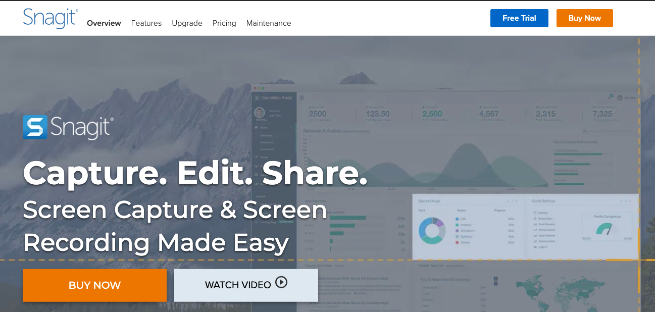
Snagit allows you to take and edit screen captures and screen recordings. This process sounds like it could be a little complicated. But right when you land on their product page, Snagit shows a simple animation that demonstrates how customers use their product. Not only does the animation make the product page look great, but it also removes roadblocks for potential customers by showing the simplicity of their product.
2. Layout
A good layout considers every visual aspect of the page to ensure visitors follow your intended eye path. That means placing headings, sub-heads, descriptions, images, white space, etc., in exactly the right place to create a visually appealing and conversion friendly product page.
Apple Example:
Why we love it
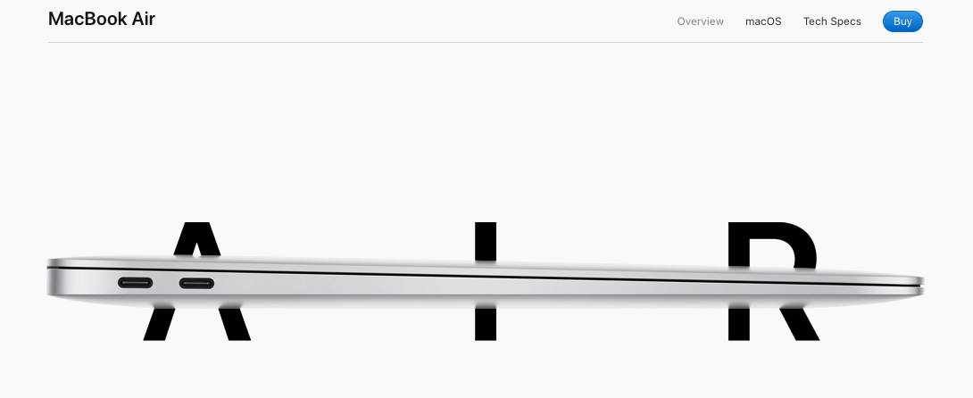
Apple knows how to make their products look good, and this product page is no exception. Above the fold is simple— just the headline “Air” overlaid with the image of the product. From there, they use white space to their advantage to highlight product features, descriptions, and videos. While the product page is long, the layout is actually very simple and invites the visitor to continue reading.
3. Product Description
Shotfarm reports that “detailed product descriptions ranked first in regards to a consumer’s decision to make a purchase, higher than reviews (second place) and price (third place).” People want to know as much about your product as possible before completing a purchase.
The takeaway: don’t be afraid to include comprehensive descriptions on your product pages. Highlight each feature with an explanation for each one. It’s better to include too much information than too little.
Phase One Example:
Why we love it
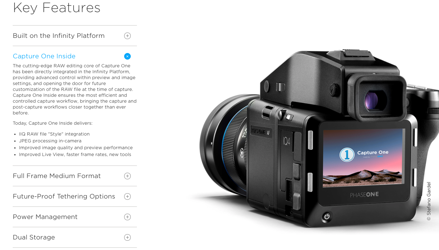
Phase One is doing product descriptions right. Instead of having a giant block of content on their product page, they’ve split their description into several tabs with simple headlines to help guide the visitor. Phase One has included all the necessary information without overwhelming customers.
4. Social Proof
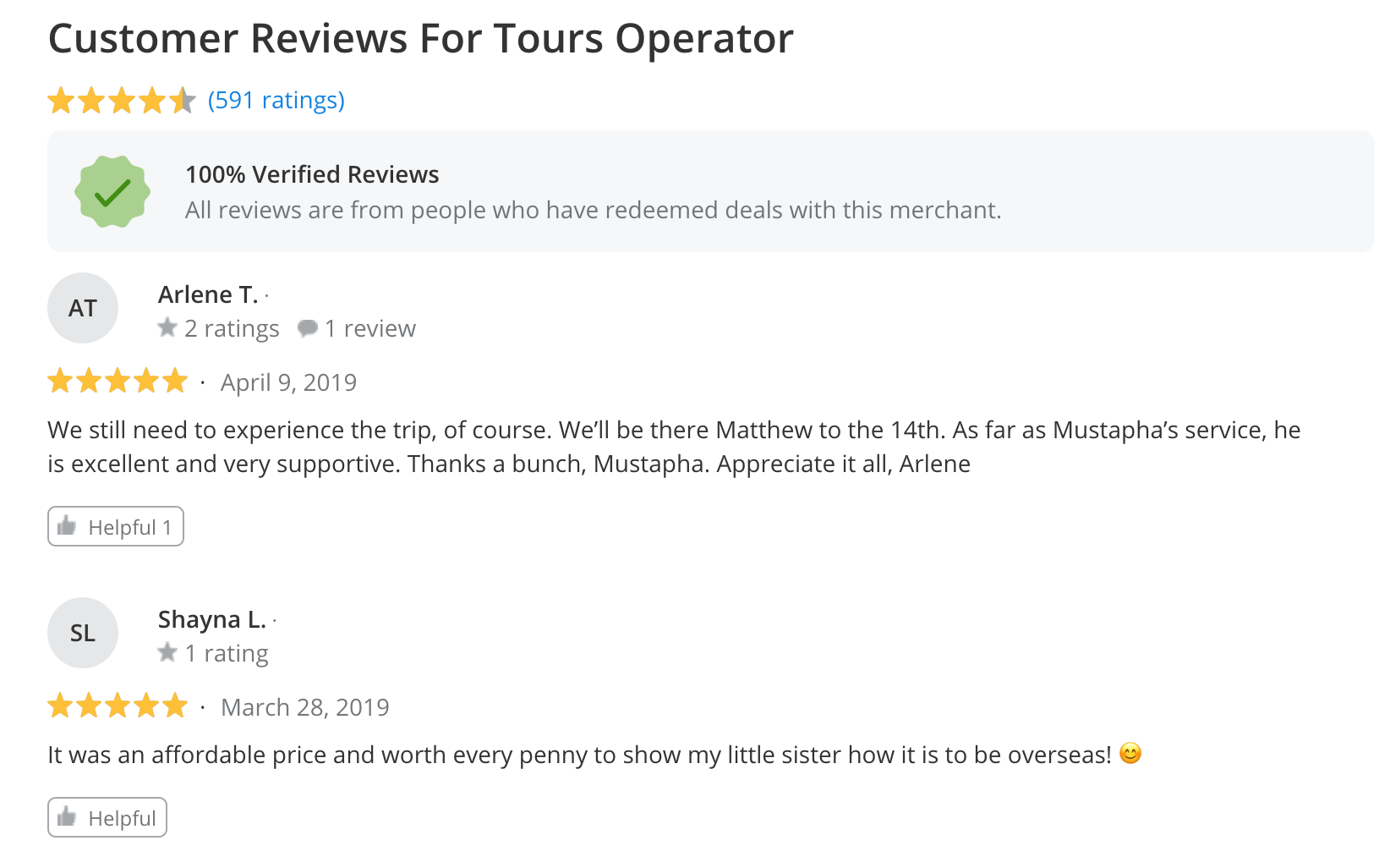
You don’t want the only content on your product page to be written by copywriters who are paid to make your product sound good. In addition to great copy, you need social proof—customer reviews, testimonials, videos, ratings, etc.—on your product page. We know, including content from outside sources can be scary, but potential customers will trust you more for keeping it real and including customer-created content.
Why we love it
At the bottom of each Groupon Getaway page, they include customer reviews for the company providing the deal. And above the reviews it says, “100% Verified Reviews – All reviews are from people who have redeemed deals with this merchant.” This simple sentence increases trust and lets customers know you value their opinions. And if you’re booking a big trip, you know how important those customer reviews can be. Let’s be serious, you don’t want to end up in a hotel full of cockroaches … or worse.
5. Product Suggestions
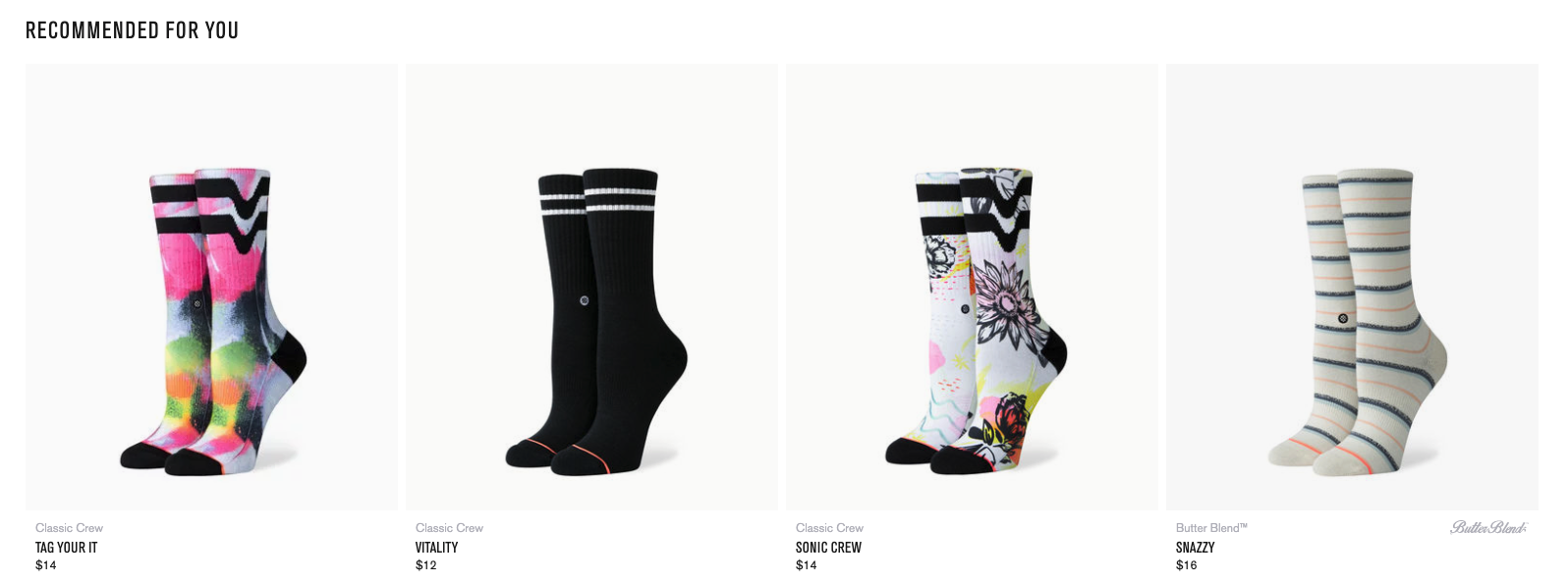
Sometimes it’s hard to know exactly what you want until someone shows you. That’s what product suggestions are all about. Often, visitors land on your product page knowing they want a similar product but haven’t been able to find the perfect one yet. Improve your conversion rate by giving visitors multiple products to consider. Include a “Customers also Viewed” section with similar products or a “Customers also purchased” section with complementary products.
Why we love it
Not only do Stance’s product pages have great layouts, detailed descriptions, and customer reviews, but they also have a “Recommended for you” section. So, if you’re not quite sold on the David Bowie socks, you can check out the Wu-Tang socks instead.
6. Additional Resources
If your product requires a big investment—time or money—customers are going to want additional guidance and help before completing a purchase. Whether it’s a chat feature, resource center, or access to tutorials, give customers the ability to dive as deep as they want into your products without having to search your website.
Capture One Example:
Why we love it
Capture One includes a “Learning Hub” on their product pages. With one click, customers have access to 50+ video tutorials all about different aspects of their products. Before completing a purchase, customers can see exactly how to perform specific tasks with the program so they know exactly what they’re getting into.
With these six elements, you have everything you need for a high-performing product page. Now you just have to find a great graphic designer and developer to make your product pages exactly how you—and your customers—want them. Happy converting!
