Studies show that trust plays an essential role in the consumer’s decision to buy online. That’s why it’s essential to ensure that trustworthiness is a fundamental quality of your checkout flow. When it comes to first-time customers, building trust in the checkout flow is especially critical, not just to close the deal, but to set the stage for future transactions.
But how do consumers arrive at that moment of trust? Harvard Business Review conducted a study to understand more about how consumers decide whether to trust websites to make online purchases. In designing their study, the researchers distinguished between two factors involved in creating trust that drives purchase decisions: structural factors and instinctual factors.
Structural factors include whether the website clearly communicates its security measures, privacy policies, or customer-satisfaction guarantees. Instinctual factors are harder to define – they have more to do with the customer’s intuition, and are driven by their overall impression of the website’s professionalism. For example, does the website use a modern layout with easy-to-read text? Are the colors pleasing to the eye?
It turns out that consumers weigh both structural and instinctual factors, but instinctual factors play a surprisingly large role in ecommerce transactions. To make sure you’re paying attention to both factors, you should make sure you’re following these five tips to build trust in your checkout flow. But the HBR researchers argue that the “implicit clues” that guide consumer intuition have a stronger impact than previously thought.
Below, we’ll address a few of these types of common mistakes that could influence your customer’s decision whether to trust you at checkout.
1. Incomplete localization
Speaking to customers in their own language is important to demonstrate that you’re truly prioritizing the needs of the customer. But gaps in a localized experience can degrade the trust you’ve worked so hard build. Remember, localization doesn’t end at translation, localization means cultural adaptation as well — and it’s all in the details.
For example, it’s easy to overlook interface elements like using the correct date and time format for that language or region, but not adapting it to your customer’s expected format can lead to major confusion. Price localization is important as well. Display prices in local currency, but also consider reviewing your pricing strategy to ensure that prices that are competitive for that country. Taking care of all these types of conversions and translations on behalf of the customer add up to provide a seamless, satisfying experience.
2. Typos in your copy
Whether it’s a misspelling or incorrect punctuation, typos happen to the best of us. Sometimes typos are innocent enough that your customer will still understand what you’re trying to say. Some typos, however, can lead to ambiguity, and that’s never a good thing. In either case, typos in your checkout flow will make your company look unprofessional and sloppy. Typos act as implicit signals that your company doesn’t pay attention to detail. It can cause even otherwise highly motivated customers to think twice about making a purchase. And for some, it will be a factor in avoiding a transaction altogether. That’s why it’s critical to implement a proofreading regimen for your entire website, but especially for any copy appearing in the checkout flow. The moment of purchase is no time for mistakes.
3. Wonky design
We all have our preferences when it comes to color or fonts. But there are certain objective indicators of solid design, and that’s where legibility and consistency come into play. Make sure your text is big enough to read and spaced correctly. Design elements should have a consistent look and feel and display an inherent logic. Buttons should be uniform, colors should correspond to a palette, and the elements should look balanced on the page. Make sure you’re testing your design on different screen sizes and orientations to ensure that text doesn’t cut off and that your images are the correct resolution.
4. Not mobile optimized
Even if you receive a good amount of traffic from desktop computers, it’s still incredibly important to make sure the checkout flow is optimized for mobile devices. Customers may consider your product from multiple devices and then decide to purchase later from their mobile phone. If your checkout flow isn’t flawless on their phones, they might bounce, never to be seen again. In addition to ensuring that the graphics and text render properly on small screens, you should take care to simplify the checkout process so that it doesn’t have too many pages. The flip side of that is to ensure that it doesn’t turn into a seemingly infinite single page! Mobile checkout should be effortless to navigate. Optimizing for mobile means also breaking up forms in a way that makes it easy for someone tapping away with two thumbs on a touch screen to accurately input their information.
Trust is in the details.

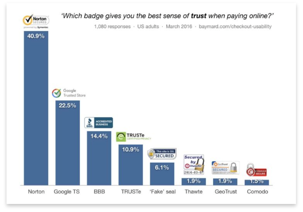
Baymard.com Checkout Usability Study
When a customer is making an online purchase, trust in your product and your checkout flow is of the utmost importance. Trustworthiness is communicated in a variety of ways, both by using and showcasing industry-standard security protocols, but also by making sure that the experience is seamless and clean. Translation gaps, typos, design flaws or other errors can make your customer hesitate and ultimately cost you a sale, so remember that even the smallest detail can go a long way towards solidifying trust with your customer.
Looking for more tips to elevate your digital business? Download our ebook, What You Need To Know About Selling Online.


