


As a growth partner, we share many of the same goals as our customers—we want to scale our business, drive more revenue, and achieve significant growth year after year. Over time, these goals require businesses of all sizes to reevaluate their brand and messaging.
FastSpring is no different. Since our beginnings in 2005, our brand has evolved many times to accommodate our ever-growing capabilities and larger industry changes.
We want to share our most recent rebrand experience as it is something most—if not all—of our customers’ experience at some point in their business lifecycle. We hope reading about our experience will help you in your own journey!
Keep reading to learn more about our journey to define a new visual identity.
A few months ago we unveiled a completely updated FastSpring website. The new logo, colors, fonts, icons, and illustrations were a culmination of months of planning and cross-functional teamwork.
The new website is only the tip of the iceberg in terms of our rebranding project. When we decided it was time to revisit the FastSpring visual identity, we took it all the way back to reevaluating three main concepts:
- Who we are as a company
- What we believe in
- How we help our customers succeed
These three concepts have been central to our success since 2005. After a decade of experience helping software companies grow, the FastSpring visual identity was ready for evolution.
In this blog post, I would like to show all the hard work and love that went into this project.
Why did FastSpring need a rebrand?
Last year we reviewed our brand and messaging and realized our message became convoluted over the years. And the look and feel of the visual brand at the time reflected that lack of clarity.
We were beginning a new chapter as a business, transitioning from a startup to a scaleup, and we needed to communicate this evolution to the market at large as well as our customers. Our goal was to create a consistent message and visual identity that we can effectively communicate across all digital touchpoints.
So we started with the first question—who are we?
FastSpring is Full-Service Ecommerce
As FastSpring has grown over the years alongside the ecommerce industry at large, part of our identity has been to seek excellence and deliver a world-class ecommerce experience to our customers. Our success is firmly rooted in the success of our customers. We’ve grown past being just a platform or solution—we are a full-service ecommerce partner.
Once we had our updated messaging in place, the next step was to translate this into a new visual identity.
Balancing Trust, Wisdom, and Creativity: Our Visual Identity
When the time came for me to bring the new Fastspring messaging to life visually, I knew I wanted our new logo, colors, typography, icons, and illustrations to represent trust, wisdom, and creativity. These characteristics are intertwined with FastSpring’s brand. As a full-service ecommerce partner, we are delivering ecommerce expertise and innovative solutions for our sellers, and we needed a visual identity that represented that in a clean, modern way.
Reimagining the Spring
The spring in the FastSpring logo has been an iconic part of our brand since 2005. It has been updated several times over the years. When developing the brand identity, it was clear that the logo was in need of a refresh to help give Fastspring a polished and contemporary feel while solving some underlying legibility issues.
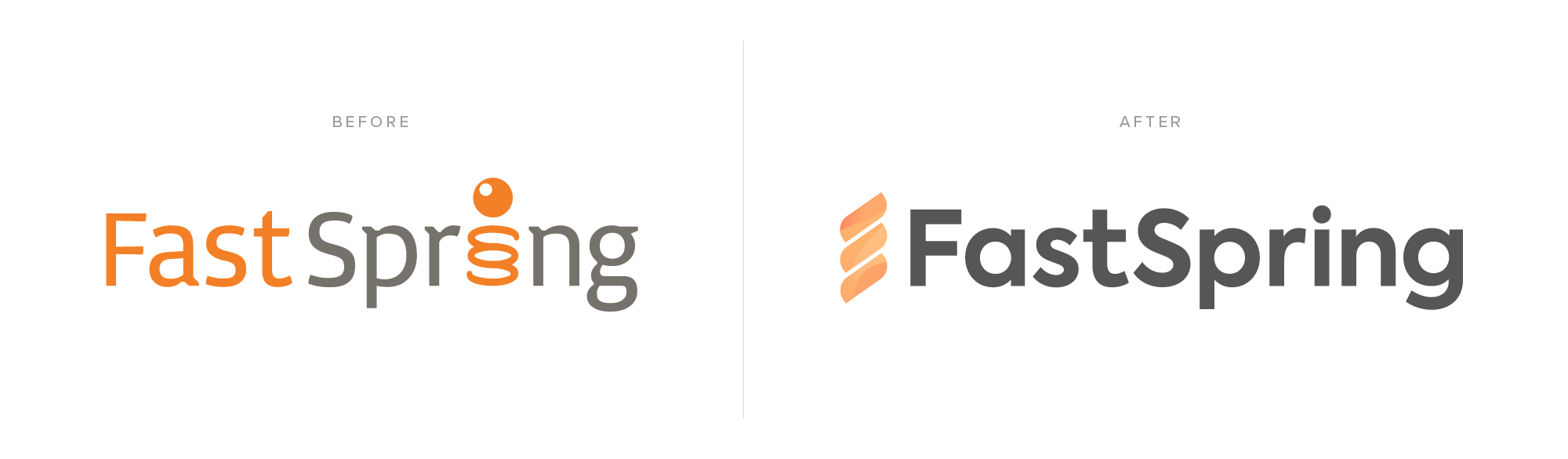
The most notable change aside from a new font and singular color is the location of the spring icon. The spring used to be tucked away inside the word “spring” but now it is leading the charge like a mix between a lightning bolt and a spring-like shape. The direction adds more movement to the icon as the lines of the spring are now set at an angle—up and to the right. The new logo evokes a sense of energy and excitement that we want viewers to feel as they are learning how FastSpring can help them sell more, stay lean, and compete big. The simplification of the shapes in the logo also works well when used at small sizes across digital platforms.
A New Approach to Colors, Typography, Icons, and Illustrations
Our previous color palette did not clearly represent who we were. There were too many colors to work with, and the tone evoked a very somber mood. Our goal with the new color palette was to define and modernize it so that it is brighter and more energetic.
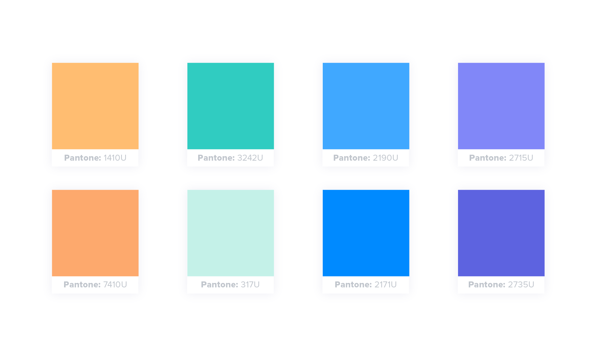
When choosing this color palette, we looked at the psychology of these colors and what they symbolize. Colors can directly influence how people feel about a brand. And we wanted our colors to symbolize trust, wisdom, and creativity.
Previously we were using one typeface which is totally fine. However, when I approached the way we visually represent our messaging, I noted that a second typeface allows for greater visual variety and establishes a better information hierarchy for our digital and print collateral.
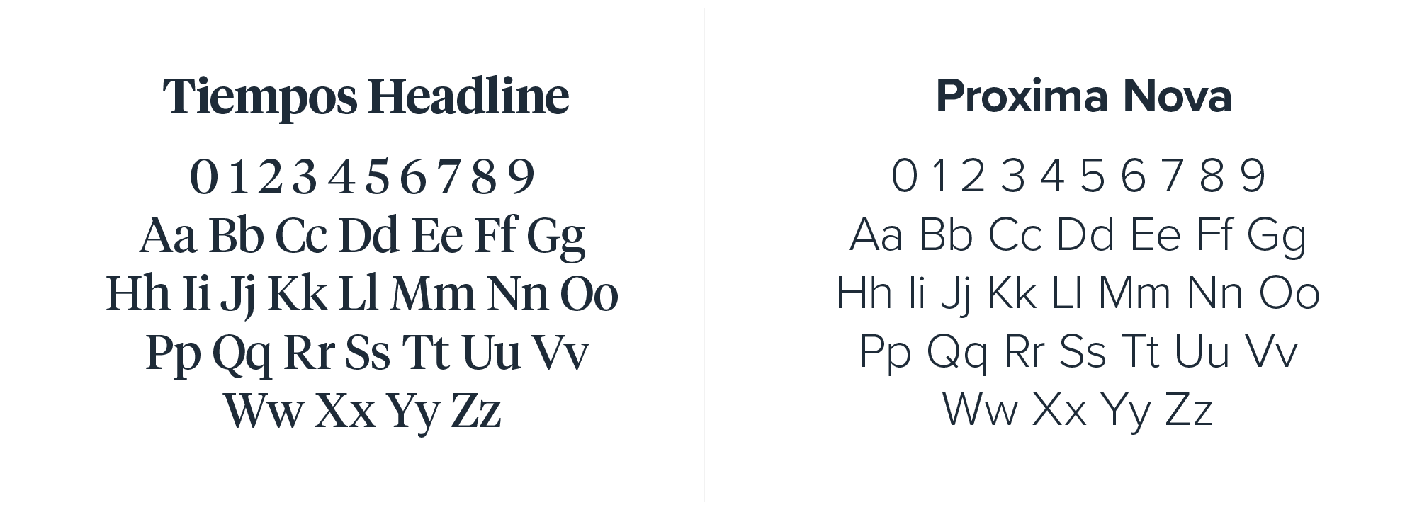
We now feature two typefaces: a serif typeface Tiempos, and a sans-serif typeface, Proxima Nova. The Serif font connects us to our identity as a trusted expert since this style is typically used in newspapers, academic articles, and magazines. By using Proxima Nova for most of our copy helps ensure that our words are accessible, easy-to-read, and free from distraction.
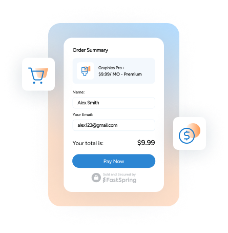
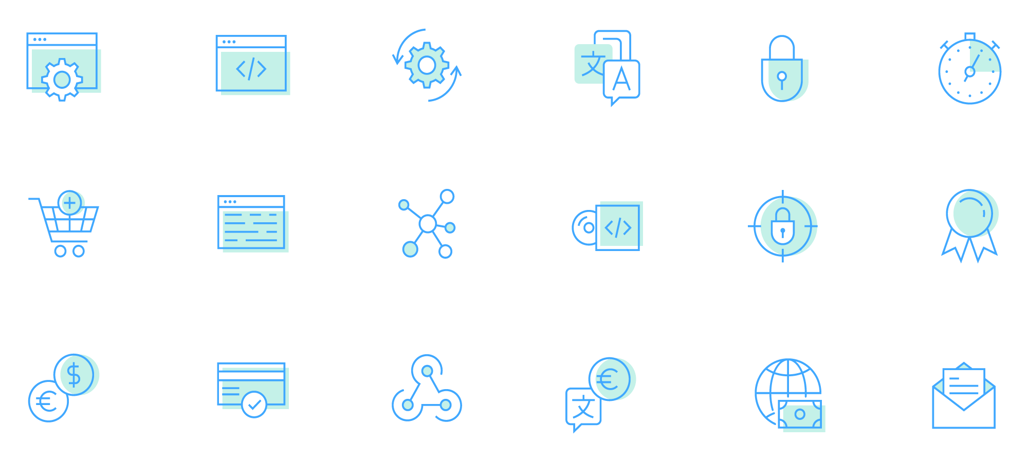
We also moved to a more simplified approach to iconography. The new icon style consists of a simple blue line icon with an offset light turquoise fill. All of our icons are completely customer for FastSpring so they can help communicate our message quickly and effectively.
Our illustrations went through a transformation from isometric illustrations to clean, simplified illustrations of our platform.
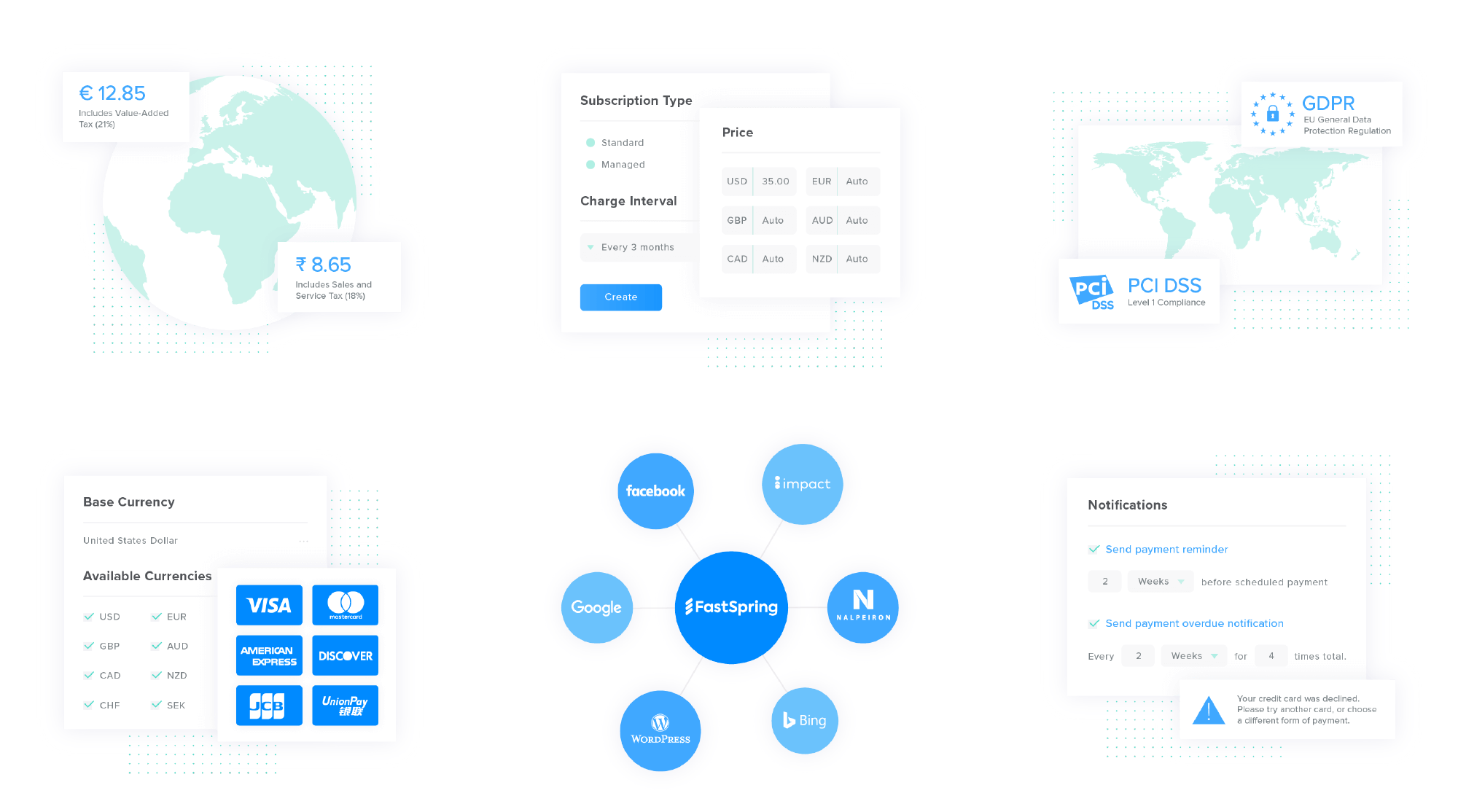
The goal of these new illustrations is to clearly communicate what our full-service ecommerce platform does and it’s underlying features in an effort to make it easier to understand the benefits of FastSpring.
Putting It All Together
This new visual identity represents a full commitment the entire company has undertaken to transform FastSpring. The rollout of these changes are ongoing and will continue to spread throughout our business. The new website is only the beginning, and we’re so excited about all the changes to come!