
Dashboards
Dashboards allow users to access all the important information in one place and help to diagnose the health of the business. You may access two dashboards from the navigation menu on the left.
FastSpring converts non-USD transactions to USD at the time of report generation. Because of varying currency exchange rates, reports may vary slightly.
Accessing Dashboards
Dashboards can be accessed from the home page through the navigation bar on the left. There are three dashboards that can be viewed as dropdowns by clicking “Dashboards” on the left navigation Menu.
- Revenue Overview
- Subscription Overview
- Chargeback Overview
Dashboard Settings
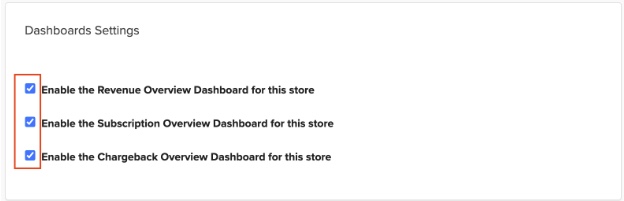
Dashboard settings give you the option to do the following:
- Disable one or both dashboards for your store
- Select one of the Dashboards as a “Default Dashboard” to show up as a default landing page.
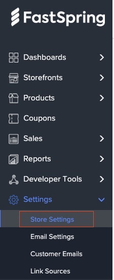
Access Dashboard Settings from Settings>Store Settings>Dashboard settings

Filters
There are four top filters to refine the analytics:

- Time frame: filter data based on selected time frame
- Product: filter data for one or more products from the dropdown
- Country: filter data for one or more countries from the dropdown
- Filter by Segment: The dashboard can be filtered on an order tag, FS_Segmentation (not case sensitive). As the order tags are Key value pairs, any text passed as a value for this reserved key can be passed along with other order details as JSON tag. The purpose is to filter the dashboards on segments specific to business and send them through order tags.
NOTE: It is highly recommended to use this order tag cautiously to avoid adding a variety of random tags to the dashboard.
Example Use case: By using the FS_Segmentation order tag with defined customer segment (B2B or B2C), you can easily sort and display data on the dashboard based on these two distinct groups. This approach is helpful because B2B and B2C segments have significant differences. It’s a great way to analyze the data separately for a more meaningful understanding.
Save a Filter
“Save Filter” allows users to save filter options. The filter combinations used frequently can be named and used late from “All save filters” from the drop-down instead of applying all the filters every time.
The filters can be saved at the user level or at an account level. This setting is prompted when the filter is saved.


Data Export

This feature can be used to get the data driving the dashboard from Fastspring to a location of your preference for further analysis.
Note: This feature is only available on the Subscription and Revenue Dashboards. This data can be accessed directly from the Data API here
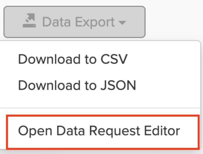
- Click on the dropdown menu for Data Export
- Select one of the download preferred formats which will automatically download the file into either a CSV or JSON format.
- Download to CSV
- Download to JSON
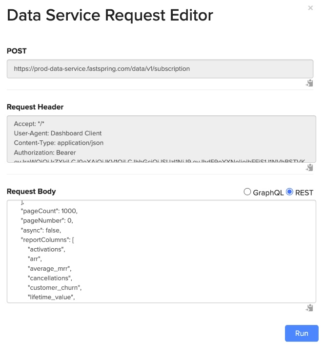
Alternatively, you can use the Open Data Request Editor option to define the fields you want to download, including the filters.
The Data Request Editor has predefined authentication token to gain permission to access data from a specific location.
Welcome Page
Users may view the “Welcome” dashboard for important revenue metrics.
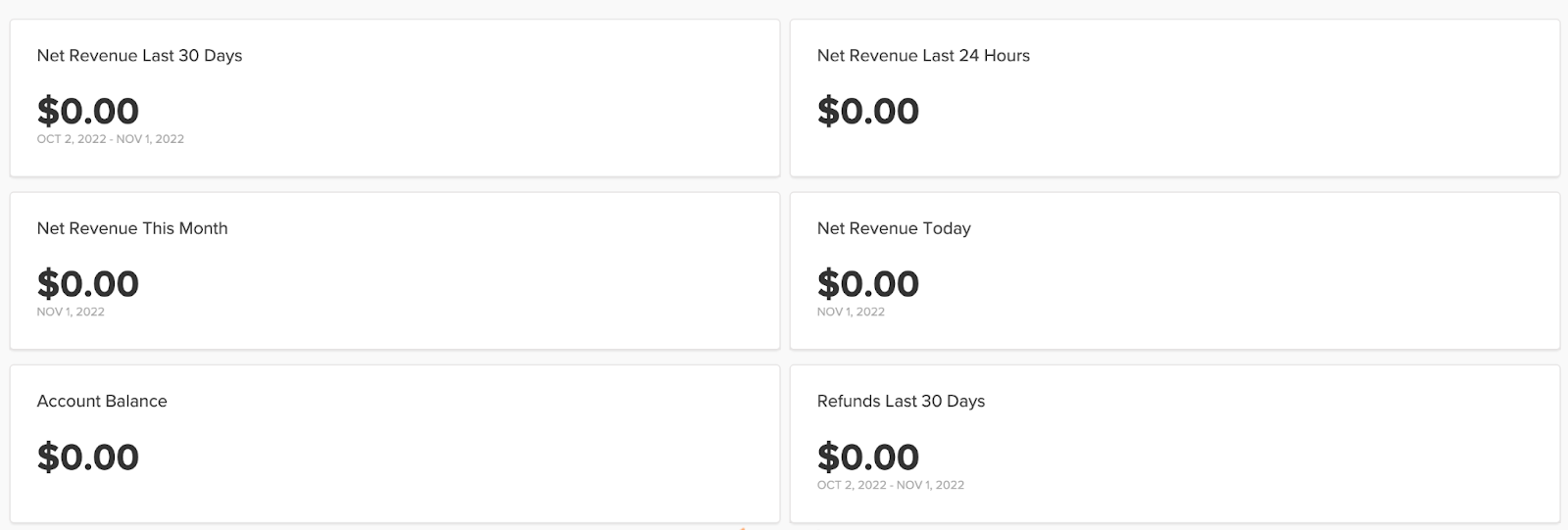
- Net Revenue: A sum of all payments received from orders and rebills (excluding refunds and taxes).
- The “This Month” timeframe represents the incomplete month to date.
- Account Balance: The USD amount that the account has accumulated for the current payout period.
- Refunds Last 30 days: The USD amount of refunds in the last thirty days.
Revenue Overview
The Revenue Overview dashboard gives users a comprehensive view of all the revenue-related metrics.
The Revenue Overview dashboard has the following Big number tiles:


- Net Sales Today: Gross sales – Refunds excluding tax
- Net Sales This week: Gross sales – Refunds excluding tax for this week(Week from Monday to Sunday). The value grows from Monday through Sunday. The value then goes down to zero at the beginning of the next week (Monday).
- Net sales Month-to-Date: Gross sales – Refunds excluding tax for the ongoing month. The initial value at the start of each month is zero, and it gradually accumulates throughout the month, representing the cumulative Net Sales for that entire month. At the conclusion of the given month, this total is displayed. The value then resets to zero as a new month begins.
- **Refunds Month-to-Date:** This metric represents the total dollar amount of refunds processed within the current month. The value displayed is the sum of refunds accumulated throughout the current month. At the start of a new month, this value resets to zero, capturing refunds from the first day of the new month onwards.
- Average Transaction Amount: This is calculated as net sales divided by the count of transactions
- Transactions: Count of transactions (not including refunded transactions)
- Units Sold: Count of items sold
- Refund Rate: Refund Item Count divided by Transaction Item Count
- This metric is calculated at the item level, not the transaction level.
- Example: if ten items were purchased in one order and five items are returned, the refund rate is 5/10 = 50%
The Revenue Overview analytical tiles below are interactive and may be clicked to open a pop-up with the following analytics:
- Compare to the previous period
- Breakdown by product, country, coupon, discount, or relationship
The reports can also be downloaded for further analysis.
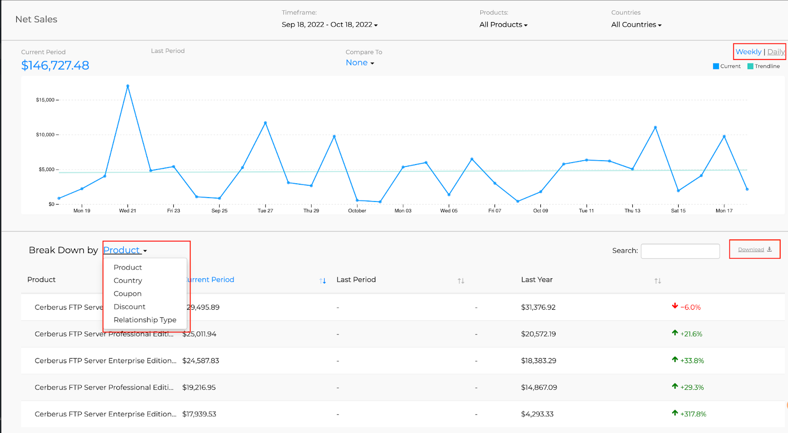
Following are the interactive analytical tiles:
Net Sales

- Net Sales: A sum of all payments received from orders and rebills. The tile displays the USD amount of net sales over timeline.
- Cumulative Net Sales: A cumulative view of net sales over timeline.
Net sales or Cumulative net sales on a specific day can be viewed by hovering on the graph. The Net Sales and Cumulative Net Sales legend can be clicked on to add/remove one of the metrics on the graph. The graph has a dual Y axis where the left axis is for Net Sales and right axis is for Cumulative Net Sales.
FastSpring excludes refunds and taxes irrespective of gross or net pricing model.
- Cumulative Net Sales: A cumulative view of net sales.
Refund Amount/Refund Transactions
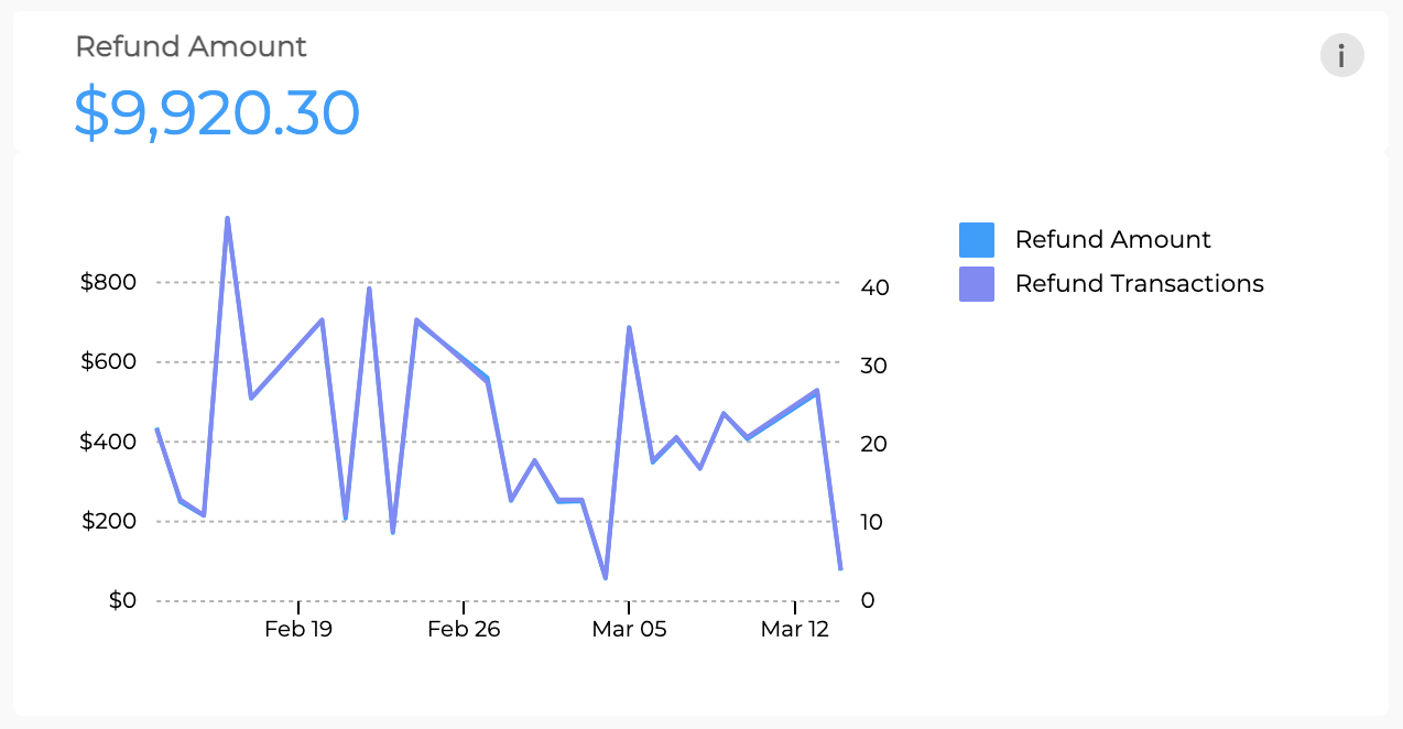
- Refund Amount: US dollar amount that was returned to customers over timeline.
- Refund transactions:Number of transactions that were refunded to customers over timeline.
Refund amount or Refund transactions on a specific day can be viewed by hovering on the graph. Refund amount or Refund transactions legend can be clicked on to add/remove one of the metrics on the graph. The graph has a dual Y axis where the left axis is for Refund amount and right axis is for Refund transaction.
Transactions/Units Sold
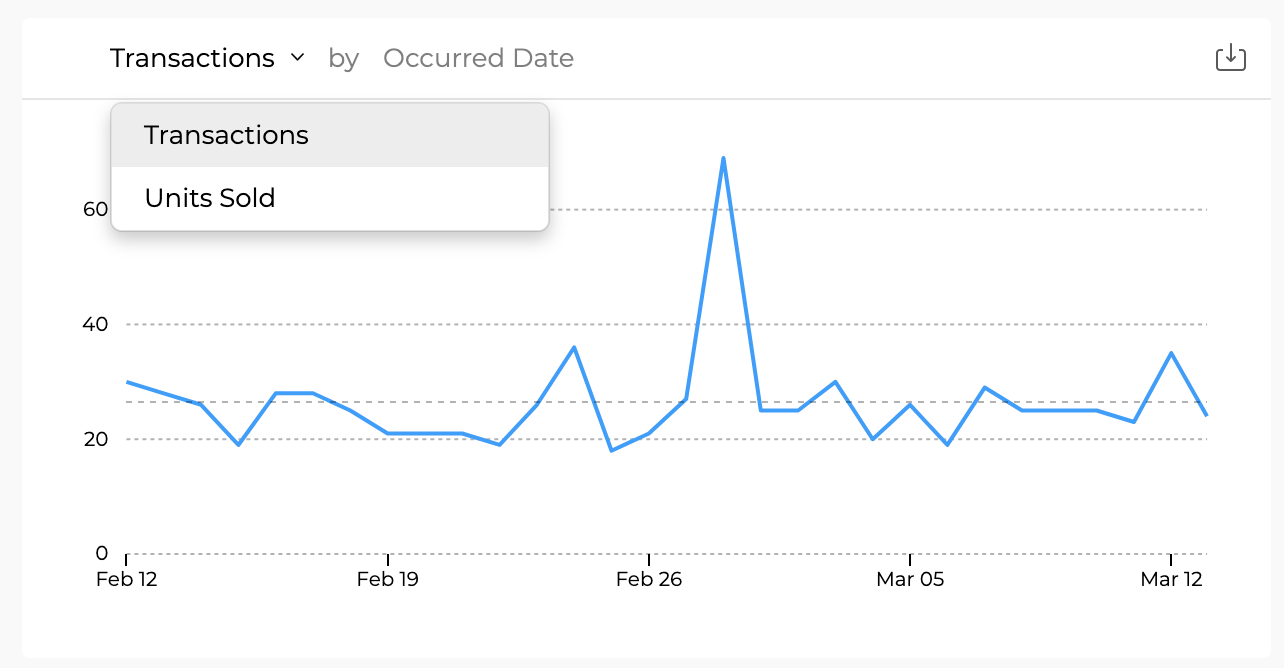
- Transactions/Units Sold: Number of transactions or number of units sold over the given timeline. Transactions or Units sold on a specific day can be viewed by hovering on the graph.
Net Sales/Transactions
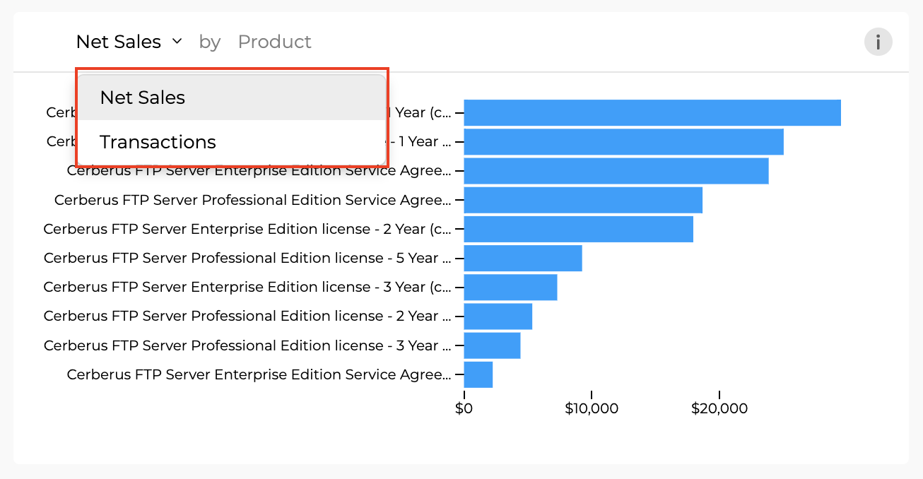
- Net Sales/ Transactions by Product: Top ten products in descending order by net sales or transactions (selected from the dropdown)
Transaction Currency
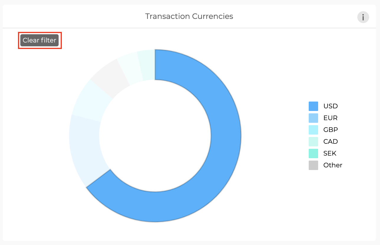
- Transaction Currency: Filter on the transaction currency tile by clicking on one or more of the colored sections of the pie chart.
- Note: Filtering on this tile will filter the currency on the entire dashboard. To remove the filter, click on “Clear Filter”.
Net Sales by Country
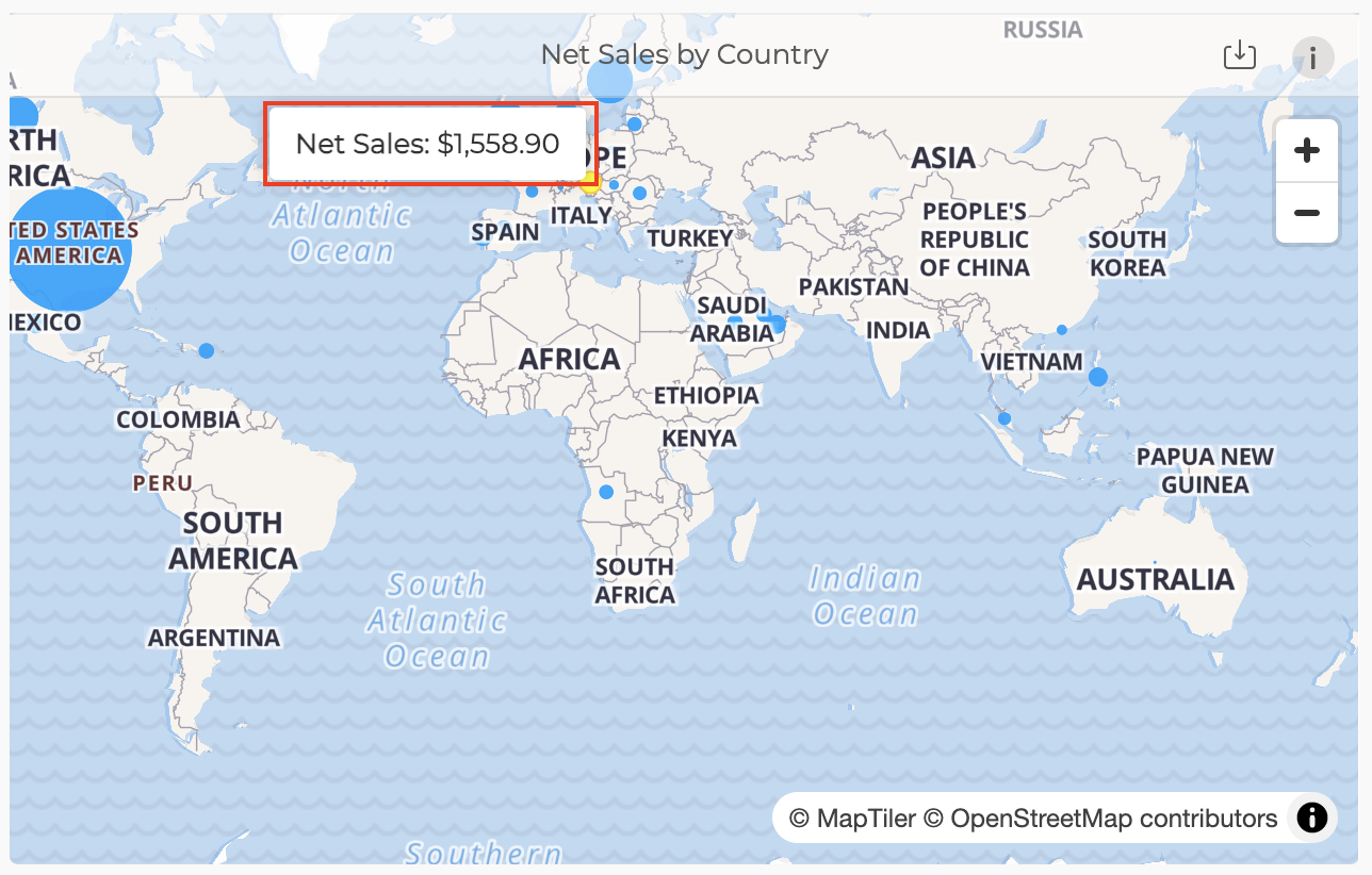
- Net Sales by Country: A map view of Net Sales by buyer country. Hovering over a country can give net sales for that country.
Subscription Overview
The Subscription Overview dashboard gives users a comprehensive view of all subscription-related metrics.
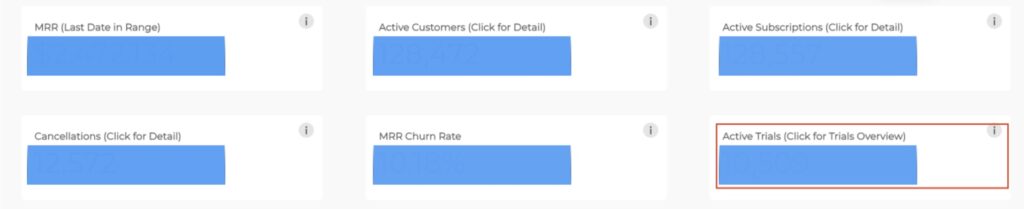
The Subscription Overview dashboard has the following Big number tiles:
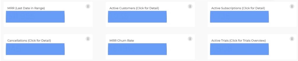
- MRR : Monthly Recurring Revenue for the selected time frame.
- The MRR value is displayed on the last day of the selected time frame.
- The MRR includes manual subscriptions as the revenue from manual subscriptions recurs on a monthly basis.
- The MRR does not include on-demand subscriptions as the revenue from on-demand subscriptions does not recur on a monthly basis.
- Refer to the [MRR Frequently Asked Questions](#anchor-Dashboard- Frequently-asked-questions) section for commonly asked questions about MRR scenarios
- Active Customers: A count of unique customers with active subscriptions in the selected time frame. This count includes customers who have canceled subscriptions that have not yet been fully churned/deactivated. The value displayed is on the last day of the selected time frame.
- Active Subscriptions: A count of active subscriptions in the selected time frame. This count includes canceled subscriptions that have not yet been fully churned/deactivated. The value displayed is on the last day of the selected time frame.
- Cancellations: A count of subscriptions canceled in the given time frame. The value displayed is for the entirety of the selected time frame.
- MRR Churn Rate: MRR lost to downgrades and cancellations as a percentage of MRR before the selected time frame.
- Active Trials: A count of active trial subscriptions as of today. This number does not change when changing the date range filter. It displays the count of active subscriptions as of today. Click in this big box number to access the Trial subscriptions Overview dashboard.
Below these tiles, a Monthly Recurring Revenue bar graph is shown which displays MRR for the past 12 months. On hover, each bar shows the Month, MRR in USD, and, MRR Growth Rate for a particular month. To gain more insight into the MMR, click on any of the bars displayed to open the Monthly recurring revenue Pop up chart.

Monthly Recurring Revenue pop-up chart
A stacked bar graph opens on clicking the MRR bar graph.
The pop-up chart has multiple options, starting with filters on the top that can be used to filter the MRR based on:

- Monthly Recurring Revenue vs MRR Growth Rate
- Time frame
- Products
- Countries
The options under the filters can be used to change the time frame for each of the bars to monthly, weekly, or daily periods. The values shown are for the last day of the selected time frame, meaning the Monthly Recurring Revenue shown for each month is for the last day of each month.

The stacked bars can be further drilled deeper by adding or removing the following variables within each bar:

- Contraction: MRR lost to cancellations and downgrades.
- Existing: MRR from the existing customers who have not made any changes to active subscriptions
- Activation: MRR contribution from new customers
- Expansion: MRR contribution from upgrades by existing customers
The MRR and MRR growth rate can be broken down by product, country, coupon, discount, or relationship type. The results in the table list can be sorted in ascending or descending order using the arrows beside each column.

Under the Monthly Recurring Revenue bar graph tile, there are 3 tiles:
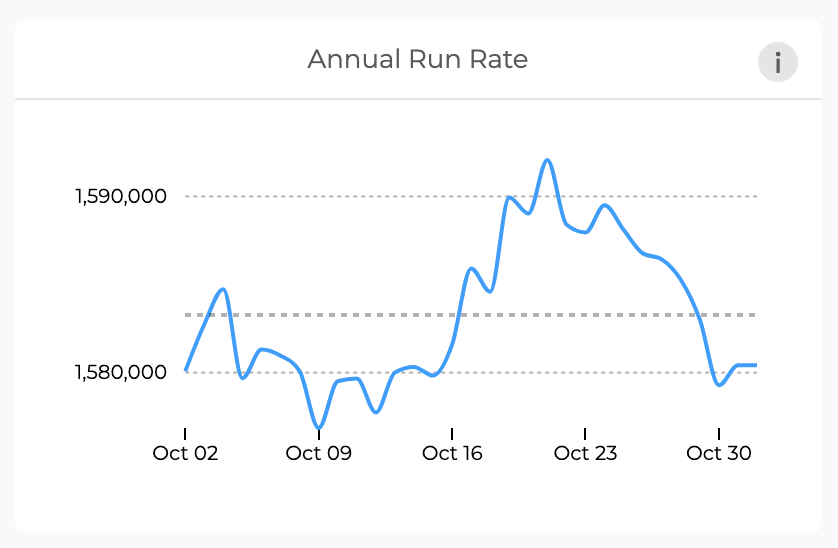
- Annual Run Rate: Annual Run rate is the annualized recurring revenue, calculated as MRR*12. The line graph has a time frame in weeks on the X-axis and USD amount on the Y-axis. On hovering, the value of the annual run rate on a given date can be viewed.
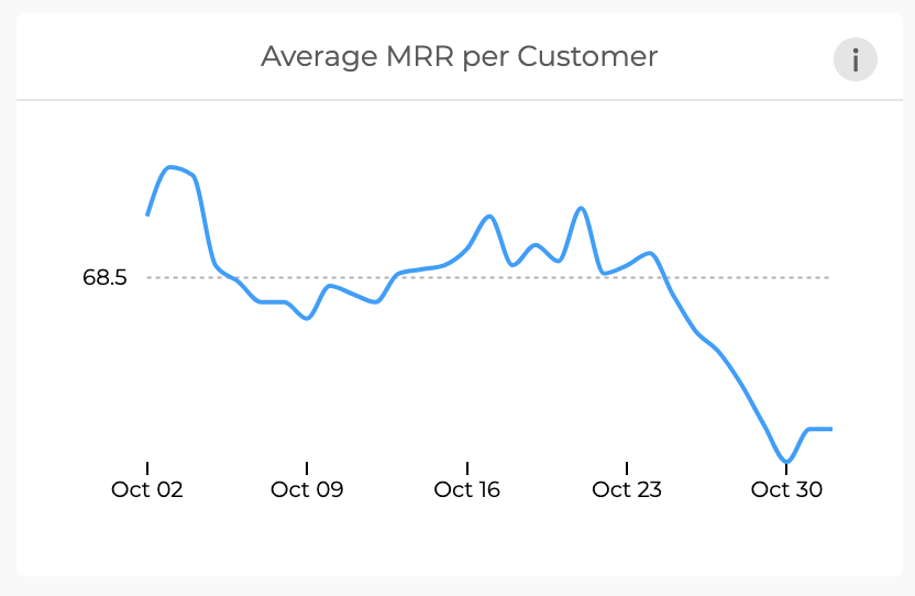
- Average MRR per Customer: Average MRR per customer is the USD amount of MRR for each individual customer, calculated as MMR divided by the number of unique customers. The line graph has a time frame in weeks on the X-axis and USD amount on the Y-axis. On hovering, the value of the average MRR per customer on a given date can be viewed.
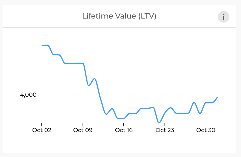
- **Lifetime Value:** Lifetime Value is the revenue generated per customer over their lifetime, calculated as the average MRR per customer divided by customer churn rate (number of customers churned (deactivated) / total number of customers). The line graph has a time frame in weeks on the X-axis and USD amount on the Y-axis. On hovering, the value of the annual run rate on a given date can be viewed.
The last row in the Subscription Overview dashboard has 3 tiles:
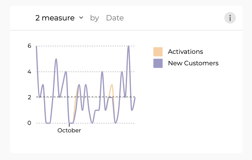
Activations and New Customers
- Activations: This is the number of new subscriptions over a time frame. The line chart has a time frame in weeks on the X-axis and the number of subscriptions on the Y-axis.
- New Customers: This is the number of new customers you have acquired over a time frame. The line chart has a time frame in weeks on the X-axis and the number of new customers on the Y-axis
The Y-axis scale values represent a different metric based on the metrics selected.
- For Activations, the number value represents new subscriptions.
- For New customers, the value represents the number of customers the business has acquired.
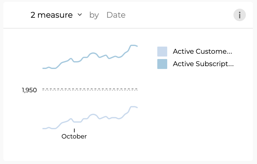
Active Customers and Active Subscriptions
- Active Customers: This is the number of unique customers with active subscriptions over a time frame. The line chart has a time frame in weeks on the X-axis and the number of active customers on the Y-axis.
- Active Subscriptions: This is the number of subscriptions that are active. The line chart has a time frame in weeks on the X-axis and the number of active subscriptions on the Y-axis.
- An active customer may have more than one subscription so these two metrics are different.
- The Y-axis scale values represent a different metric based on the metrics selected.
- For active customers, the number value represents the number of customers.
- For active subscriptions, the value represents the number of subscriptions.
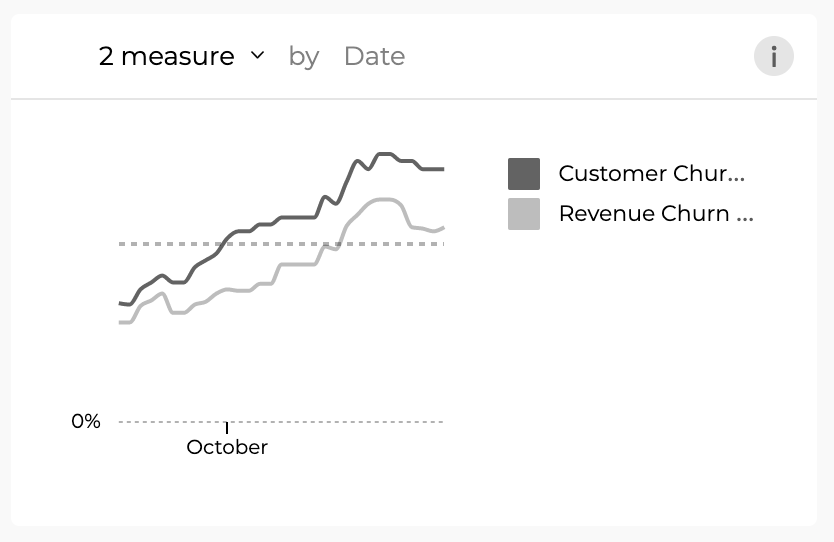
Customer Churn Rate and Revenue Churn Rate
- Customer Churn Rate: This is the number of customers who canceled the subscriptions as a percentage of total customers. On any given day, the customer churn rate value considers cancellations in the last 30 days and the current count of active customers. The line chart has a time frame in weeks on the X-axis and customer churn rate as a percentage on the Y-axis.
- Revenue Churn Rate: This is the USD amount of monthly recurring revenue lost to cancellations and downgrades as a percentage of MRR. On any given day, the revenue churn rate value considers MRR lost in the last 30 days and the current MRR. The line chart has a time frame in weeks on the X-axis and revenue churn rate as a percentage on the Y-axis.
The Y-axis scale values represent a different metric based on the metrics selected.
- For Customer Churn Rate, the number value represents the percentage of customers.
- For Revenue Churn Rate, the value represents the percentage of MRR.
Trial Subscription Overview
To access the Trial Subscription overview, click on the Active Trials big number box in the Subscriptions Overview Dashboard.
The Trial Subscriptions Overview dashboard gives users a comprehensive view of all the trials related metrics.
The Trial Subscriptions Overview dashboard has the following Big number tiles:

Total Active trials: This is the number of active trial subscriptions in the selected date range. This does not include the trial subscriptions that had an outcome(converted into a paid subscription/ canceled trial/ trial ended). This count implies the number of trial subscriptions that are under evaluation by the potential customers that will result in any of the above-mentioned outcomes.
Average trial days: The average number of days customers evaluate the trial products across all the trial offerings before taking a decision. The trial subscriptions may be configured for any number of days(usually under 30 days). This number will be averaged for all the trial subscriptions.
Example:
There are 2 trial subscriptions offered by a business. One is 7 days trial and the other one is 14 days trial. Assuming all the customers are converting at the end of the trial, the average trial length will be 10.5 days.
However, the assumption made will not be the case as customers will evaluate the products for some time and take a decision(convert into a paid customer or cancel a trial subscription before the end of the trial). The Average trial days box gives visibility into the average time customers are taking to evaluate the products across the portfolio. Applying filters for products can help to understand the time customers are taking to evaluate the products and optimize the trial length.
Trial conversion rate(Lifetime): Number of trial subscriptions that converted into paid subscriptions of all the trial subscription sign-ups. This is calculated by dividing the number of trial subscriptions converted into paid subscriptions(tracking the conversion event) by the total number of trial subscription activations for the lifetime of the business.
Example:
If a business has 100 trial subscription sign-ups in its lifetime(from the time they introduced the trial subscription program until today and 10 trial subscriptions out of these 100 converted into paid subscriptions. The trial conversion rate for this business will be 10%. Even when the date range filter on the top is changed, the value in this big box number will not change as this ratio is for the lifetime and does not look at the filtered date range.
NOTE: This includes all the trial subscriptions(lifetime) irrespective of the date range filter selected in the dashboard.
Cancellation rate(Lifetime): Number of trial subscriptions that were canceled by the user of all the trial subscriptions activated in lifetime. This is calculated by dividing the number of trial subscriptions that were canceled divided by the total number of trial subscriptions activated for the lifetime of the business.
NOTE: This includes all the trial subscriptions(lifetime) irrespective of the date range filter selected in the dashboard.
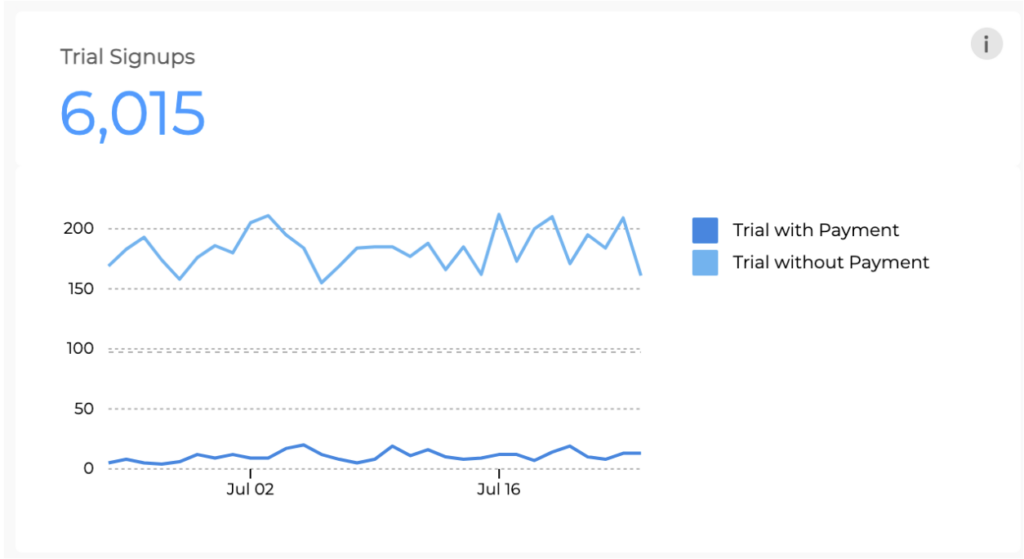
Trial Signups
Multiple line chart showing the number of trial subscriptions signed up by date broken down by trial type.
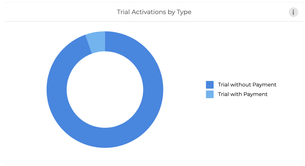
Trial Activations by Type
Donut chart showing the breakdown of trial subscriptions activated in the selected date range by type of trial(Trial without payment method/Trial with payment method/Paid trial)
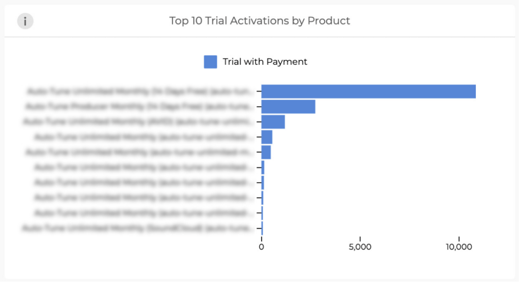
Top 10 Trial Activations by Product
Horizontal bar graph showing the top 10 products with the highest number of trial subscription activations.
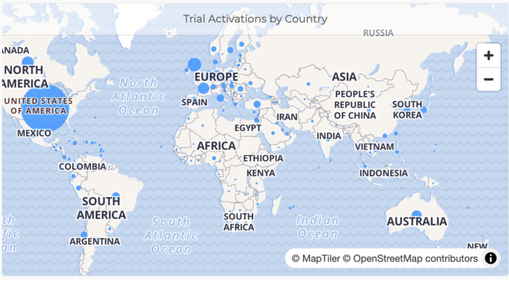
Trial Activation by Country
A map view of trial activations by country. Hover over the blue circles/dots to view the count of trials activated in a given country.
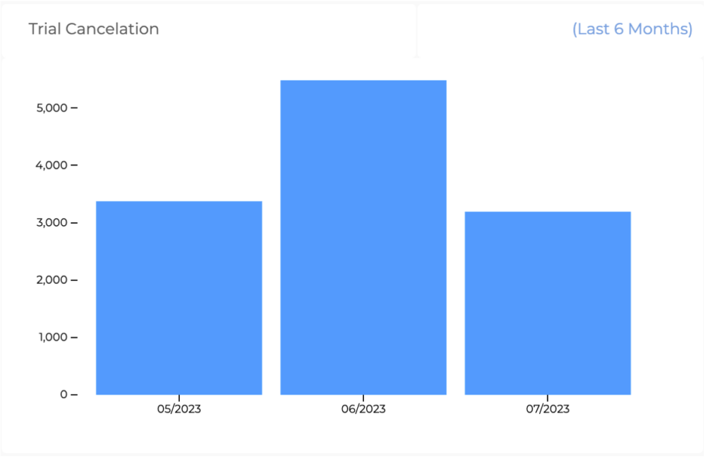
Trial Cancelations(Last 6 months)
Bar chart showing the number of trial cancelations month on month in the last 6 months. The bar chart has the month on the X axis and the number of trial subscriptions canceled on the Y axis.
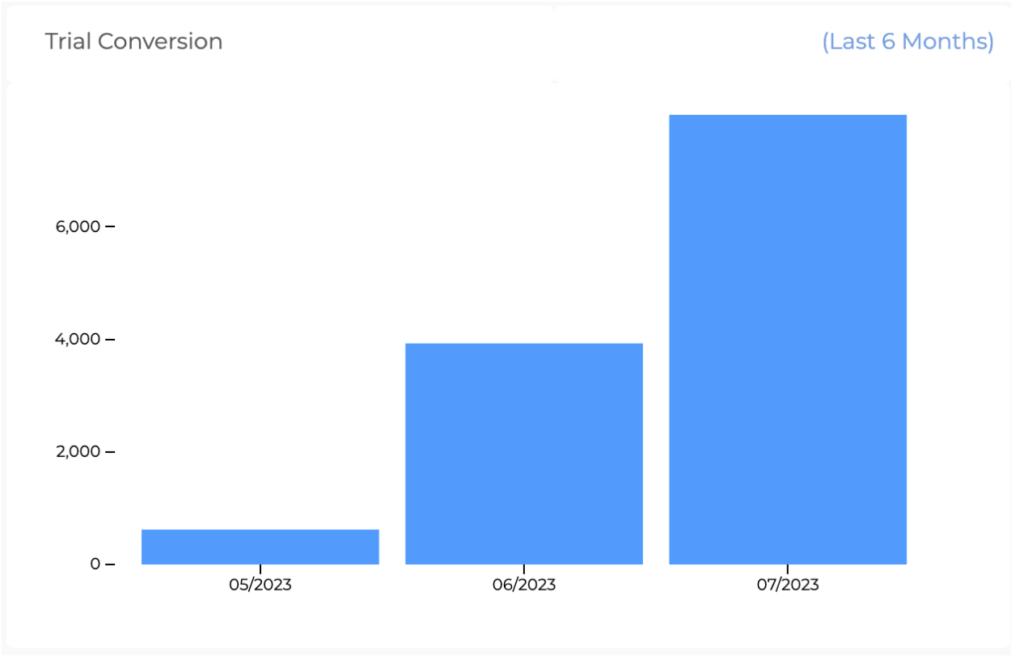
Trial Conversions(Last 6 months)
Bar chart showing the number of trial conversions monthly in the last 6 months. The bar chart has the month on the X axis and the number of trial subscriptions converted on the Y axis.
Trial Subscriptions lifecycle
A funnel chart showing the number of trial subscriptions in different stages of trial subscription lifecycle.
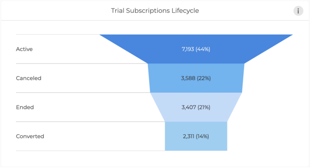
The trial subscription lifecycle has 4 possible states after the activation:
Active: Trial subscriptions that are “Active” signify the number of subscriptions that are being evaluated actively by the user.
Canceled: Trial subscriptions that are “Canceled” are the number of subscriptions that were canceled by the users. This lifecycle status is triggered by the user taking the action of canceling the trial subscription.
Ended: Trial subscriptions that “Ended” are the number of trial subscriptions that ended the defined trial period. This lifecycle status is triggered by the system at the end of the trial period when the user does not take any action to change the status of the trial subscription lifecycle.
Converted: Trial subscriptions that are “Converted” are the number of trial subscriptions that converted the defined trial period. This lifecycle status is triggered by either user action or by the system depending upon the type of the Trial.
- Trial with a payment method: the system automatically charges the customer at the end of the trial period.
- Trial without a payment method: the customer is charged by the user’s action of adding payment details and giving his consent to charge for the subscription.
- Paid trial: the customer is charged automatically by the system the regular subscription fee. Paid trial is conventionally configured to give the subscription at a discounted price during the trial, upon conversion the discounted price does not apply anymore and the subscription is charged the full amount.
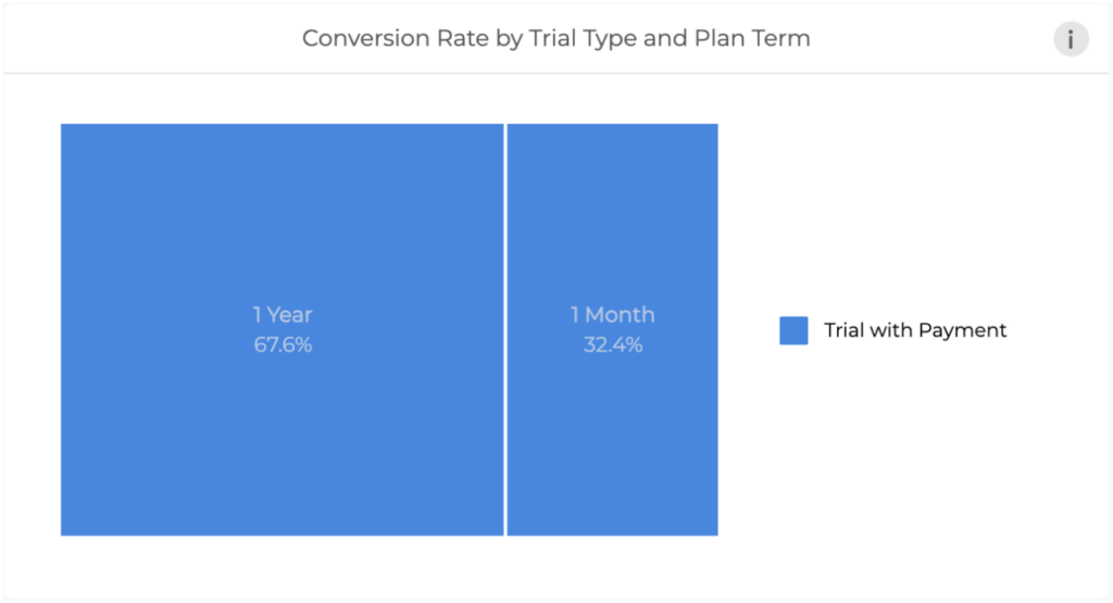
Conversion rate by trial type and Plan term
A tree-map graph that captures the conversions of trial subscriptions broken down by trial type (Trial with payment/Trial without payment and Paid Trial) by plan term.
Chargeback Overview
The Chargeback Overview dashboard gives users a comprehensive view of all chargeback transactions.
The Chargeback Overview dashboard has the following Big number tiles:
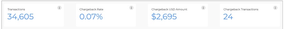
- Transactions: Total count of transactions
- Chargeback Rate: Number of transactions marked as chargebacks/ total number of transactions
- Chargeback USD Amount: Total USD amount for the chargeback transactions + applicable chargeback fee for respective transactions.
- Chargeback Transactions: Count of transactions marked as chargebacks.
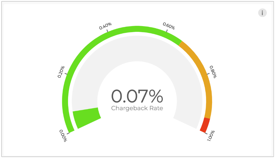
Chargeback Rate Meter
This chargeback rate meter indicates the health of the business with respect to the Chargeback rate.
- A chargeback rate in green: You are within the payment hold threshold and don’t need to take any preventative action.
- A chargeback rate in orange: You are approaching the payment hold threshold and there may be checks and/or holds applied to your payouts.
- A chargeback rate in red: You have reached the payment hold threshold and a hold will be applied on your account balance to cover potential losses.
Please feel free to reach out to [email protected] if you have any questions related to your chargeback rate.
Monthly Chargeback Transactions(Non-subscription vs Subscription Initial vs Subscription Recurring) – Last 12 months
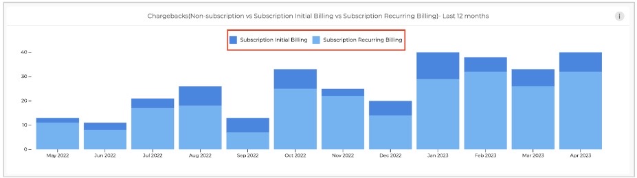
A stacked bar chart that has month on month Chargeback transactions for the last 12 months. The color stacked based on:
- non-subscription
- subscription initial billing
- subscription recurring billing transactions.
NOTE: The items on the legend are clickable and can be used to filter the chargeback transactions on the graph based on the description.
Top Chargeback Transactions by Product
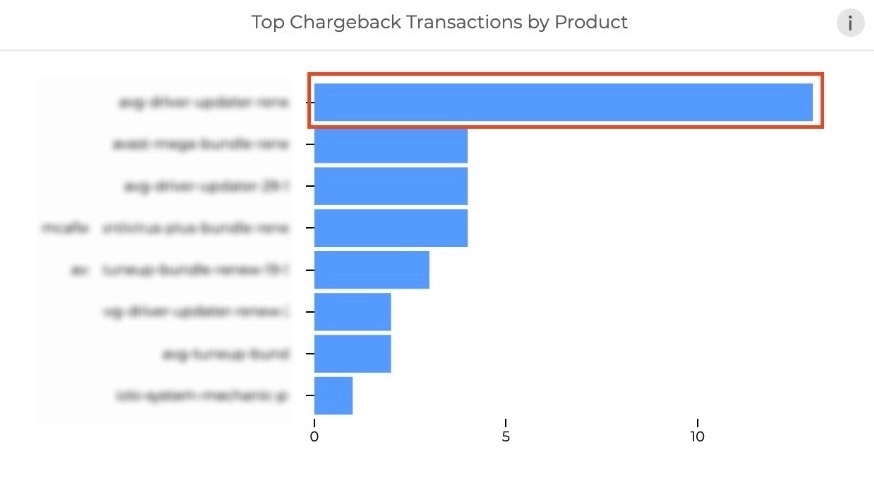
A horizontal bar graph that gives a comparison of chargeback transactions by product.
- The horizontal bars are clickable and can be used to filter the dashboard based on the selected product(s)
Chargeback Transaction by Country
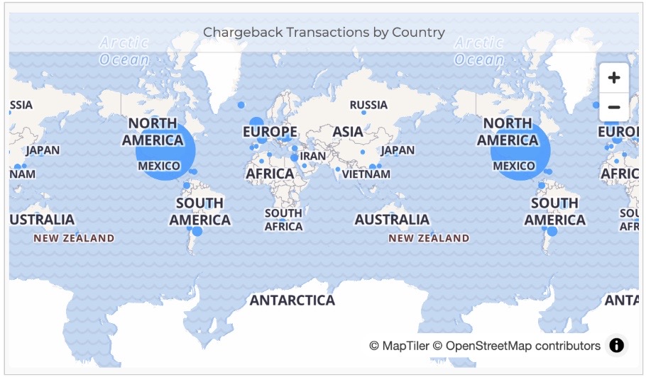
A map view of chargeback transactions by buyer country. Hovering over a country can give chargeback transactions for that country.
Chargeback Transactions by Payment Method
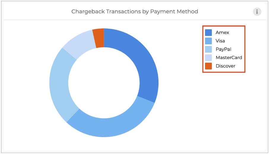
Chargeback transactions are segmented by payment method in the donut chart.
- The payment methods in the legend of the tile can be clicked upon to apply filters for specific payment method(s).
Chargeback Transactions by Currency
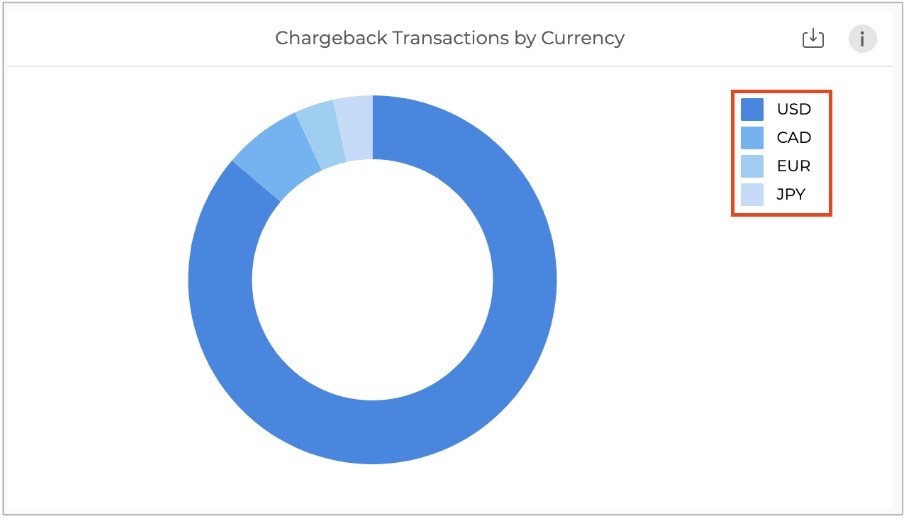
Chargeback transactions are segmented by currency in the donut chart.
- The currencies in the legend of the tile can be clicked upon to apply filters for specific currency(s).
Recent Chargeback Transactions
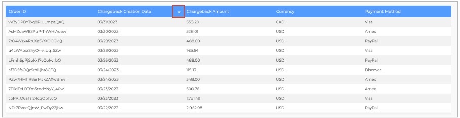
A grid view of recent transactions that can be used to operationalize handling of the chargeback transactions on a daily basis.
The grid view has details of the following columns for each transaction:
- Order ID: The unique ID for transactions marked as Chargeback.
- Chargeback creation date: The date on which the transaction was marked as a chargeback.
- Chargeback amount: The USD amount that is the sum of the order value and the chargeback fee on the transaction
- Currency: The currency in which the user transacted.
- Payment method: The payment method used for the transaction
NOTE: The arrows beside each column header can be used to sort the rows in ascending/descending order.
Frequently Asked Questions
MRR Frequently Asked Questions
How do annual subscriptions convert into MRR?
Annual subscription amount is divided by 12 to calculate the MRR.
Example:
A company offers an annual subscription for $1,200. The MRR for this subscription would divide the total annual amount by 12, as follows:
MRR = $1,200 / 12 = $100
The MRR for this annual subscription is $100.
How do deactivation vs cancellation events affect MRR?
Refer to Understanding Cancelation vs. Churn/Deactivate
How is foreign exchange conversion calculation done in MRR calculation?
FastSpring calculates the MRR contribution of a subscription by looking at the most recent events on the subscription and using the foreign exchange rates that were in effect on the event occurrence date to convert foreign currency to USD. For instance, when an upgrade or downgrade activity occurs on a subscription, FastSpring uses the foreign currency to USD conversion rate on the activity date to adjust the MRR contribution of the subscription accordingly. Similarly, the foreign currency exchange rates for rebill/renewal, and resume activities are also updated in the same manner.
NOTE: If there is no other activity on a subscription except for activation, FastSpring uses the foreign currency exchange rate to USD as of the activation date to calculate the MRR contribution of the subscription.
Dashboard Alerts
The Dashboard Alerts section will outline upcoming changes so you are aware and prepared when these changes are implemented.
MRR Calculation Change
Date of change: September 21, 2023
Summary:
Existing Logic:
In the current “Subscription Overview” dashboard, when a customer cancels their subscription, it immediately triggers an MRR change, excludes the subscription’s revenue from MRR calculations, and removes the subscription and associated customer from the “Active subscriptions” and “Active customers” count
New Logic:
We’re changing this process to count voluntary canceled subscriptions (user-initiated cancellations) towards MRR until their churn/deactivation date.
Cancellation: Customer initiated event, clicking on “Cancel Subscription” CTA
Churn/Deactivation : System initiated upon an unsuccessful attempt to charge for subscription, including for a cancellation event at the time of subscription renewal.
Understanding MRR calculation:
Monthly Recurring Revenue is the monthly revenue that a subscription generates (excluding tax) while it is active. Subscriptions that are charged weekly, annually, or otherwise will have their MRR calculated by normalizing for a monthly period.
Example: If a customer subscribes for an annual subscription for $120, the adjustment of this value to monthly would be, 120/12 (spreading $120 equally across all the months in the year) , and $10 will be the MRR from the subscription.
How to read MRR in a business context as a future predicting metric:
If the lifecycle status of all the active subscriptions remains unchanged, the business will make the revenue from the above calculation in the next 30 days and every 30 days thereafter (Month on Month).
NOTE: Exhaustive lifecycle statuses of a subscription are:
- Active
- Churned/Deactivated
Below is the exhaustive list of events that result in the changes to the lifecycle of subscription and/or associated MRR:
- Upgrade: MRR goes up as the customer has moved to a higher-priced product
- Downgrade: MRR goes down as the customer has moved to a lower-priced product
- Pause: MRR goes down to 0 as the customer has paused the subscription
- Resume: MRR goes back to its original value as the customer has resumed the subscription.
Understanding Cancellation vs. Churn/Deactivate:
Cancellation:
When a customer cancels a subscription, by clicking on the “Cancel my subscription” CTA, the status of the subscription is still “Active” but the subscription will have a “Cancellation” event (Captured with a time stamp) and the subscription will churn/deactivate at the end of the Subscription term.
Canceled subscription (Subscription with Cancellation time stamp): The user can still access the subscription product until the end of the subscription term.
Churn/Deactivate:
A subscription can move to the “Churned/Deactivated” state in 2 ways:
- A canceled subscription at the end of the subscription term (Voluntary Churn/Deactivate).
- An active subscription at the end of the subscription term upon unsuccessful billing (Involuntary Churn/Deactivate)
Subscription in “Churned/Deactivated” state: The user cannot access the subscription product anymore as the subscription term has already expired and access to software has been revoked.
Existing logic for MRR calculations:
When a subscription is canceled, the revenue contribution from that subscription to MRR is removed effectively from the date when the customer has canceled the subscription.
*The subscription can also move into the “Churn/Deactivate” state without the “Cancellation” event and in this case, revenue contribution from that subscription to MRR is removed effectively from the date when the status changed to “Churned/Deactivated”.
Example:
If a monthly subscription for $10 per month is activated on Jan 1st, 2023. The subscription will contribute $10 to the MRR if nothing changes in the status of the subscription.
Scenario 1: The subscription is canceled on Jan 15th, 2023. The subscription will have a “Cancellation” event ( a time stamp to capture the user action of clicking the “Cancel subscription” CTA) on Jan 15th, 2023. The MRR contribution from the subscription becomes 0 from Jan 15th, 2023 and the “Active Customer” and “Active Subscription” go down by 1. The subscription churns/deactivates on Jan 31st, 2023. The MRR contribution from the subscription does not change anymore as it has already been changed to 0 on Jan 15th, 2023.
| Metric | Status as of Jan 1st, 2023: Active | Status as of Jan 15th, 2023: Canceled | Status as of Jan 31st, 2023: Churned/Deactivated |
| MRR | $10 | $0 | $0 |
| Active Customers | 1 | 0 | 0 |
| Active Subscriptions | 1 | 0 | 0 |
Scenario 2: At the time of subscription renewal FastSpring attempts to charge the customer on Jan 31st, 2023 and the billing is not successful, the subscription status changes to “Churned/Deactivated”, the MRR contribution from the subscription becomes $0, the “Active Customer” and “Active Subscription” go down by 1.
| Metric | Status as of Jan 1st, 2023: Active | Status as of Jan 15th, 2023: Active | Status as of Jan 31st, 2023: Churned/Deactivated |
| MRR | $10 | $10 | $0 |
| Active Customers | 1 | 1 | 0 |
| Active Subscriptions | 1 | 1 | 0 |
NOTE: The above example does not take into account the dunning cycle to make the example easy to understand. The above subscription will go into dunning and will attempt to charge the customer a few times (depending upon the configuration) before reaching the end of the dunning cycle and triggering the “Churn/Deactivate” event. The status of the subscription during the dunning cycle is “Active”
New logic for MRR calculation:
The new logic would only look at the “Churn/Deactivate” status change and will not consider the “Cancelation” event for changing the revenue contribution of a subscription to MRR.
Example:
Using the above example and the same context, there is a monthly subscription for $10 activated on Jan 1st, 2023. The subscription will contribute $10 to the MRR if nothing changes in the status of the subscription.
Scenario 1: The subscription is canceled on Jan 15th, 2023. The subscription has a “Cancellation” event on Jan 15th, 2023. The MRR contribution from the subscription does not change on Jan 15th, 2023. The subscription churns/deactivates on Jan 31st, 2023 and the status of subscription changes from “Active” to “Churned/Deactivated”. The MRR contribution from the subscription changes to 0 on Jan 31st, 2023. The “Active Customer” and “Active Subscription” go down by 1 on the same date as well.
| Metric | Status as of Jan 1st, 2023: Active | Status as of Jan 15th, 2023: Canceled | Status as of Jan 31st, 2023: Churned/Deactivated |
| MRR | $10 | $10 | $0 |
| Active Customers | 1 | 1 | 0 |
| Active Subscriptions | 1 | 1 | 0 |
Scenario 2: The way this scenario is handled remains the same. The subscription is not canceled so the FastSpring system attempts to charge the customer on Jan 31st, 2023. If the billing is not successful, the MRR contribution from the subscription becomes $0. The “Active Customer” and “Active Subscription” go down by 1 on the same date as well.
| Metric | Status as of Jan 1st, 2023: Active | Status as of Jan 15th, 2023: Active | Status as of Jan 31st, 2023: Churned/Deactivated |
| MRR | $10 | $10 | $0 |
| Active Customers | 1 | 1 | 0 |
| Active Subscriptions | 1 | 1 | 0 |
Derived changes on the “Subscription Overview” dashboard:
As this change will result in a change in MRR and Active Customer count, the numbers will change as follows on the Subscription Overview dashboard.
- Annual Recurring Revenue (ARR):
Calculation: MRR*12
Impact: The ARR will change 12 times the difference in old vs. new MRR. The new MRR is expected to go higher so the ARR will be higher than the present value on the dashboard (As ARR is 12* MRR, the change will increase the ARR significantly).
- Average MRR per customer:
Calculation: MRR / Number of active customers
Impact: Both the numerator and denominator will change and the ratio will change accordingly. This ratio might remain close to present-day value as the “MRR” (numerator) will go up and the “Active Customer” count (denominator) will go up as well.
- Churn rate (Customer and Revenue):
Calculation: Number of customers churned/deactivated in last 30 days / Count of active customers 30 days prior
Impact: The numerator and denominator will change and the ratio will change accordingly. The numerator will go down as the count of churned/deactivated customers will not include canceled subscriptions with a future churn/deactivate date and the denominator will go up as the customers who canceled their subscriptions but whose subscription has not been churned/deactivated will be included in “Active customers” count so the ratio will be lower than the present-day value.
- Life Time Value (LTV):
Calculation: Average MRR per customer / Customer Churn/Deactivate rate
Impact: Both the numerator and denominator will change. Average MRR per customer will not change significantly but the Churn/Deactivate rate will decrease relatively in the ratio and as a result, the LTV will go up.
- Contraction MRR on Pop-up:
Calculation: MRR decreased due to cancellations and downgrades.
Impact: Since the logic for cancellation is changing the MRR contributed from cancellations will also change. Downgrade logic is not changing. The Contraction MRR will go down from the existing value as the MRR from subscriptions that were canceled but not churned/deactivated will not be included in the calculation.
Updated 4 months ago