Question: What’s the most important page on a software website — other than the homepage?
Answer: It’s the pricing page.
How do we know?
Because we have data from thousands of Saas and software websites.
The path to a signup or purchase may include a variety of page views, but it almost always includes the pricing page.
In this article, we’ll show you examples from a variety of SaaS pricing pages. No matter how you’re selling your SaaS products, you’ll find best practices to improve your pricing page for increased conversions.
We’ll also include some bonus tips to help you with strategies beyond the page design — including packaging, optimizing pricing for LTV, and more.
Note: FastSpring offers advanced subscription management services that support free trials, monthly and annual paid plans, proration, discount management, and more. Learn more here.
7 SaaS pricing page examples
1. Social Bee: Optimize for free trial conversions
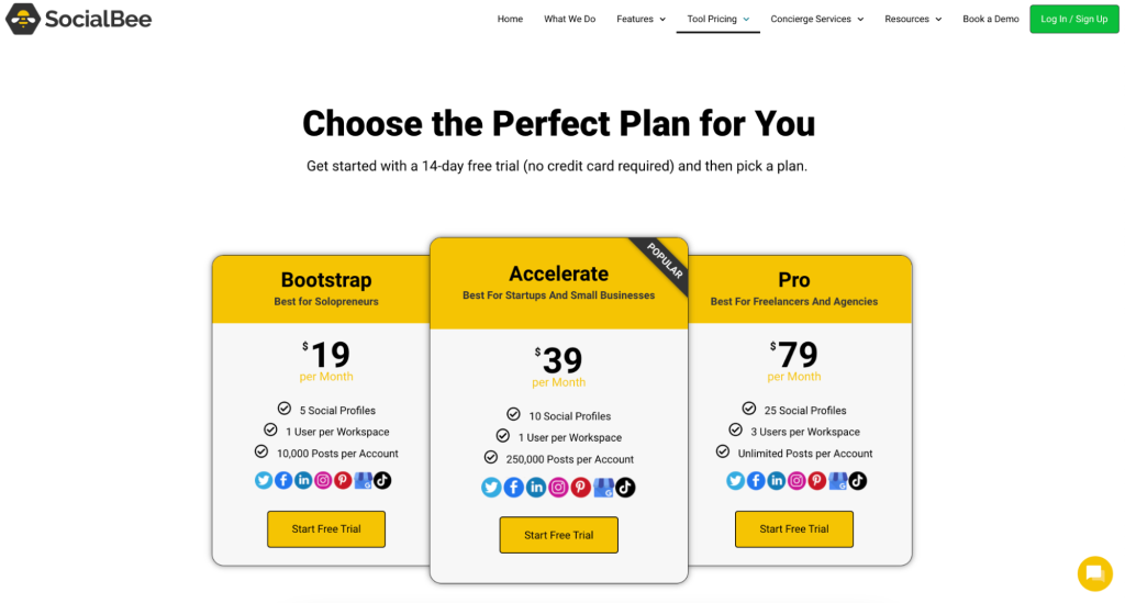
SocialBee is a social media management tool that uses a product-led growth model hinging around a free trial. In the social media management market, being able to explore the product is an important part of the buying experience.
For PLG-centered companies in particular, the pricing page often serves as:
- A way to enter the sales funnel through a free trial or freemium plan.
- The place to upgrade to a paid plan.
For those reasons, a PLG-centered pricing page needs to be optimized to:
- Encourage first-time visitors to try out the product.
- Convert to a paid plan.
Here are a few of the best practices SocialBee employs.
No credit card required — a strategy to increase sign-ups
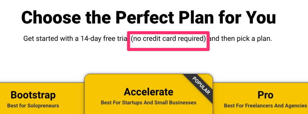
In general, prospects are more likely to sign up for a free trial if they’re not asked to hand over their credit card information upfront.
One SaaS company saw a 12.5% increase in conversions when they added the no credit card required language. SocialBee makes this front and center in its messaging.
Call out personas in the plan comparison
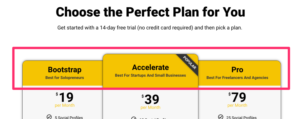
If your plans target different user bases, make it very obvious which plan is right for them.
SocialBee uses simple language that differentiates the ideal user for each plan.
Add a summary table for pricing plans
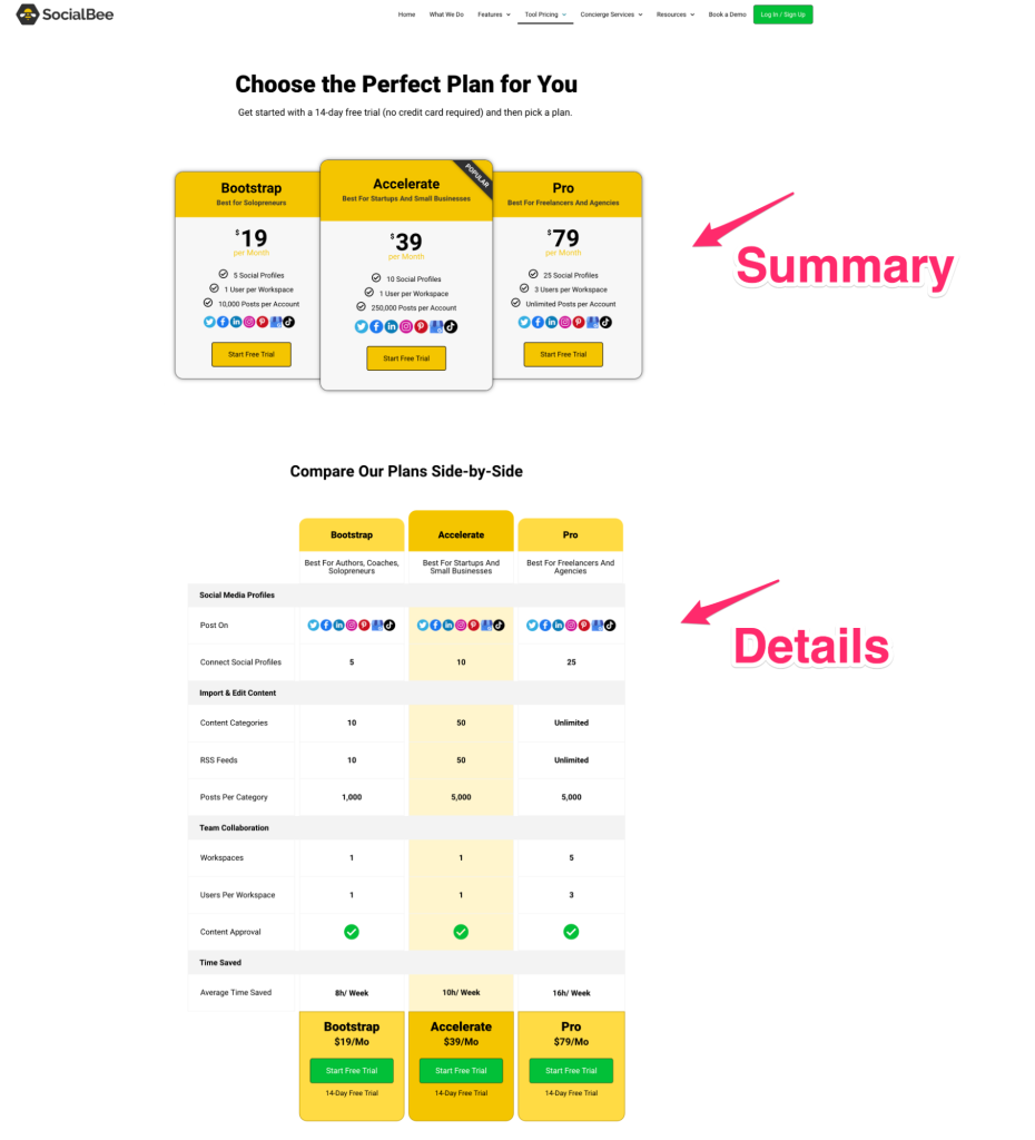
Prospects can get bogged down in the details when comparing different plans. It’s common for subscription-based companies to have one long comparison table to differentiate their plans.
SocialBee’s strategy is to use two pricing tables: one to highlight all the primary differences and most important features of each plan, and a second that goes into more detail.
2. LanguageTool: Customize subscriptions
Another PLG example, LanguageTool uses a freemium model that works with browser extensions and software plugins.
What we love about their pricing page is all the customization that helps prospects understand their options.
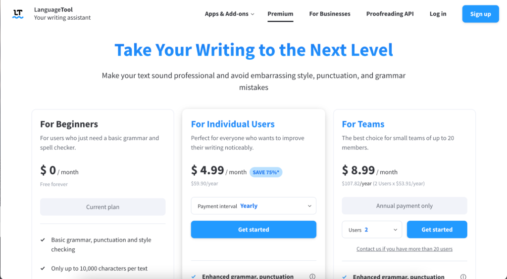
Here are a few things we noticed about LanguageTool’s pricing page design:
Localization can double conversions
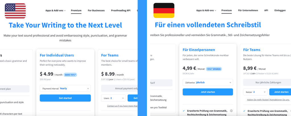
As you can see, LanguageTool localizes its pricing and checkout experience, showing different languages to different website visitors — depending on the visitor’s location.
From our own research, we know that sellers that display local currencies and payment methods convert at up to twice the rate of those that don’t.
Note: SaaS companies can support 20+ currencies and other popular local payment methods from around the globe using FastSpring’s localized checkout platform. Learn more here.
Encourage longer subscriptions through discounts
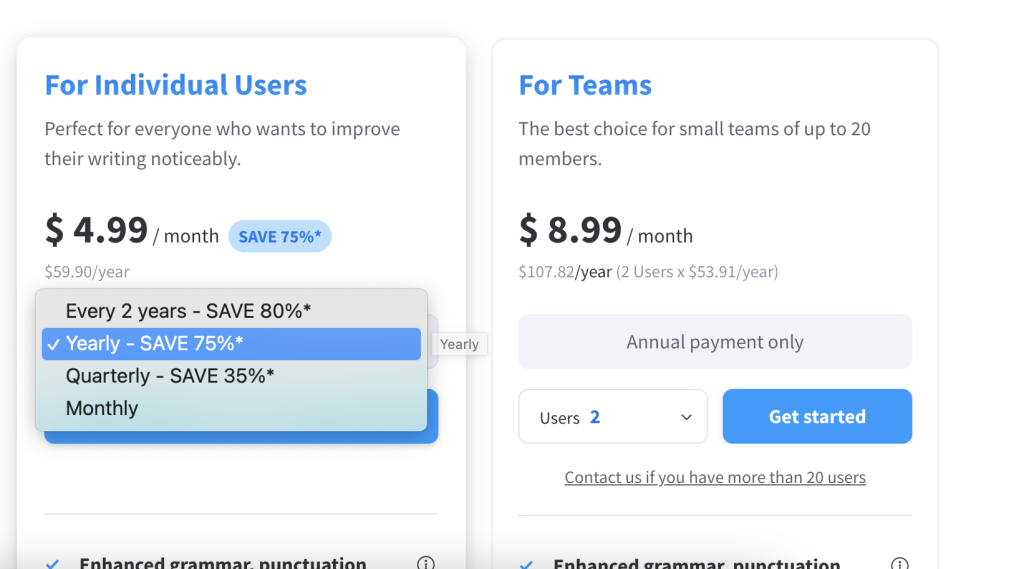
LanguageTool’s primary plan allows prospects to choose between four different lengths of time with different discounts.
Another company, Meebo, saw a 121% increase in revenue by offering a discount if users selected a two-year plan.
Automatically update pricing based on user-inputted variables
LanguageTool allows a prospect to see how costs change based on a team’s size. The automatically updating drop-down is a smooth way to show variable pricing.
3. Sphere Engine: Optimized for custom plans
Sphere Engine helps software companies create coding assessment solutions and enhanced software development environments. Since its products need to be customized for each customer, it doesn’t offer the typical subscription tiered plans.
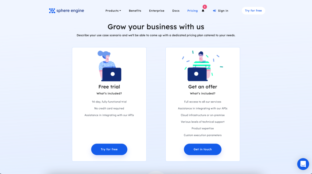
Here are a few things we notice about Sphere Engine’s pricing page strategy:
Offer clearly defined buying experiences
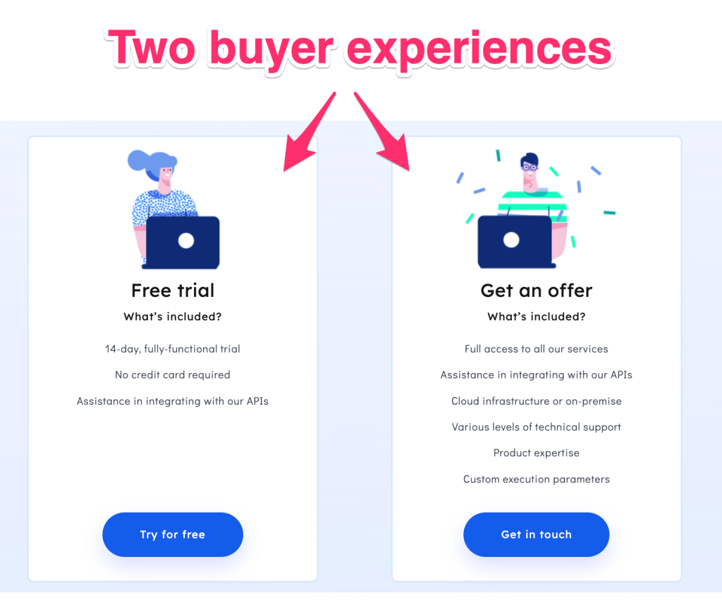
Sphere Engine’s pricing page has two main CTAs:
- A free trial.
- A custom quote.
This gives the buyer two paths they can choose during the signup process. But what we love about this page is how simple it is. It is clear what’s going to happen with both choices.
In the “Try for free” path, the prospect can easily see what’s included in a trial: how long it lasts, whether support will be available, whether there will be limited functionality, etc. Also notice that, once again, they highlight that no credit card is required.
In the “Get in touch” path, prospects know what they’re choosing — a conversation with a sales team.
Social proof increases trust

A list of customer logos, as we see on Sphere Engine’s page, is a proven strategy to provide social proof, which has been shown to boost conversations by 12% or more.
Not all logos need to be well known. Featuring some of your small — but loyal — customers is a great way of showing you value their business.
4. LiveReacting: Monthly subscription plans as an upsell
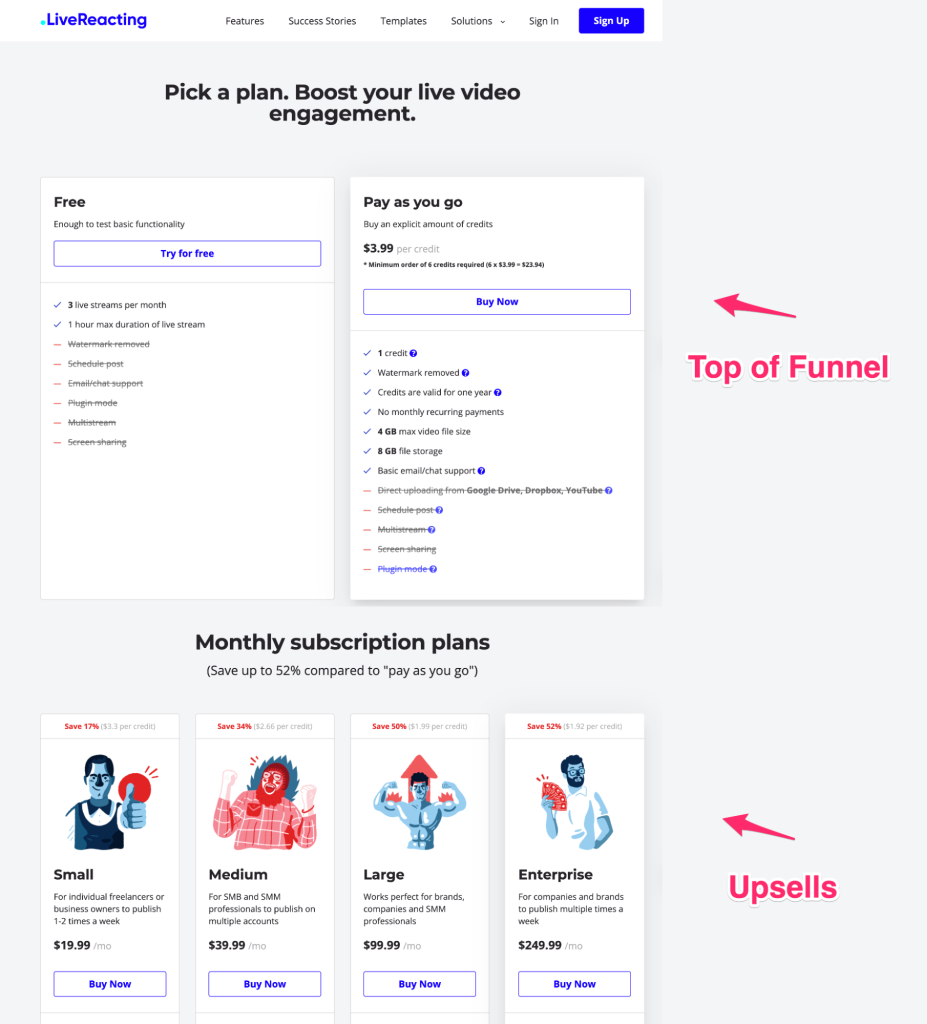
LiveReacting is a live stream enhancement solution that offers three types of subscriptions:
- A free plan.
- A “pay as you go” plan.
- A subscription plan for both infrequent and frequent users.
This satisfies a wide variety of users, giving prospects options to fit their needs and their situation. Here’s how LiveReacting sets up its pricing page.
Show the cost savings of a subscription plan
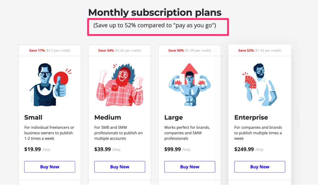
LiveReacting promotes free and “pay as you go” models first and then its recurring billing plans.
The company’s two non-subscription plans give users the opportunity to try the product. It also offers infrequent users the ability to use the product without making a monthly commitment.
Meanwhile, prospects likely to use the product more frequently can easily see the cost savings of a monthly subscription.
Use a value proposition to improve your main headline
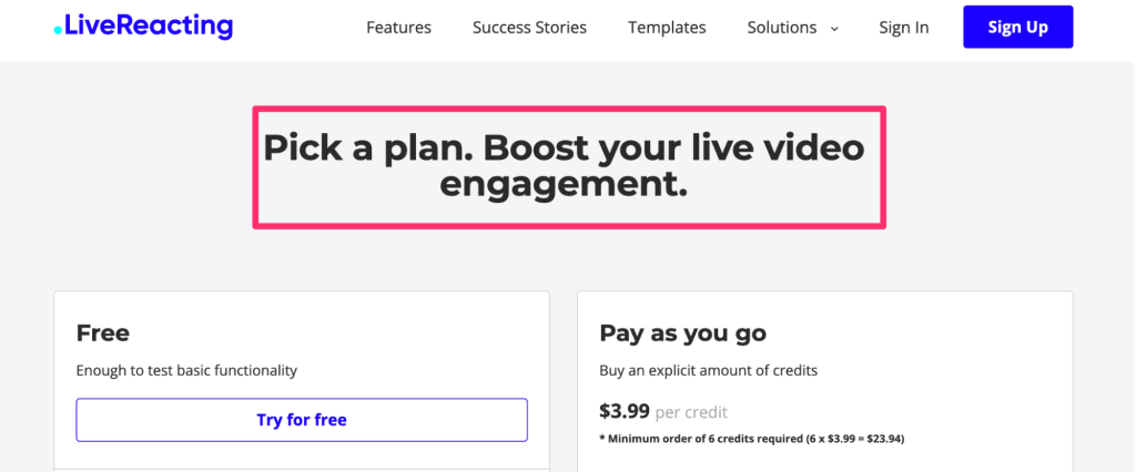
Pricing pages don’t have to say “pricing page” at the top. You can use your page’s main heading to reinforce your positioning, which helps reassure potential customers that this is the right product for them.
LiveReacting shows just what a prospect will get when they sign up for a plan: better live video engagement.
Want more proof? Castos, a podcast platform, increased conversions by 91% by renaming their page and making its CTA buttons stand out more.
5. SmartReach: Three buyer personas, one page
SmartReach, a sales tool for cold email outreach, maintains plans for individuals, businesses, and agencies.
To offer tiers for each audience, it uses toggles to offer pricing options for different business types:
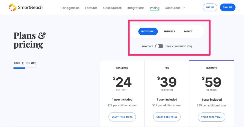
Here are some other techniques SmartReach is using on its pricing page:
Frequently asked questions to relieve FUD
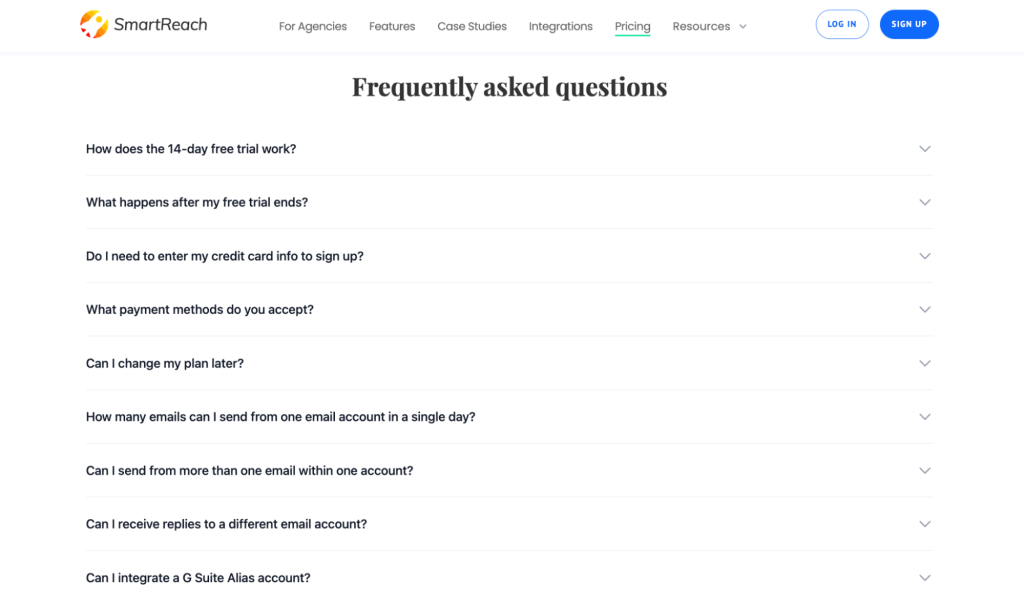
FUD = Fear, uncertainty, and doubt.
Having an FAQ section on your pricing page is a technique to relieve the most common FUD your prospects have when considering your products. SmartReach uses an expandable design to answer common questions without cluttering the page.
Sell more with live chat
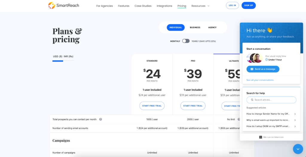
If a prospect’s questions aren’t answered in the FAQs, they may need more support before signing up. An effective live chat strategy can increase SaaS conversions 45% or more.
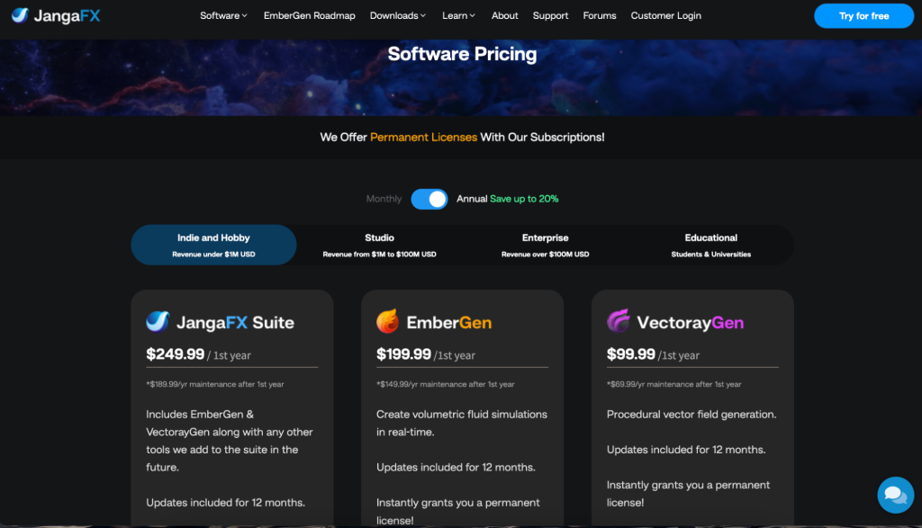
6. JangaFX: Sell multiple products on one page
JangaFX is a software company that makes real-time VFX tools for artists and designers within the video game and film industries.
Like SmartReach, JangaFX also uses toggles to separate out pricing per persona, but instead of tiered subscription plans on each toggle, it sells several products with different prices based on a user’s or business’s revenue:
Highlight testimonials
JangaFX makes good use of testimonials, adding them below the main pricing options in a way that doesn’t crowd the page:
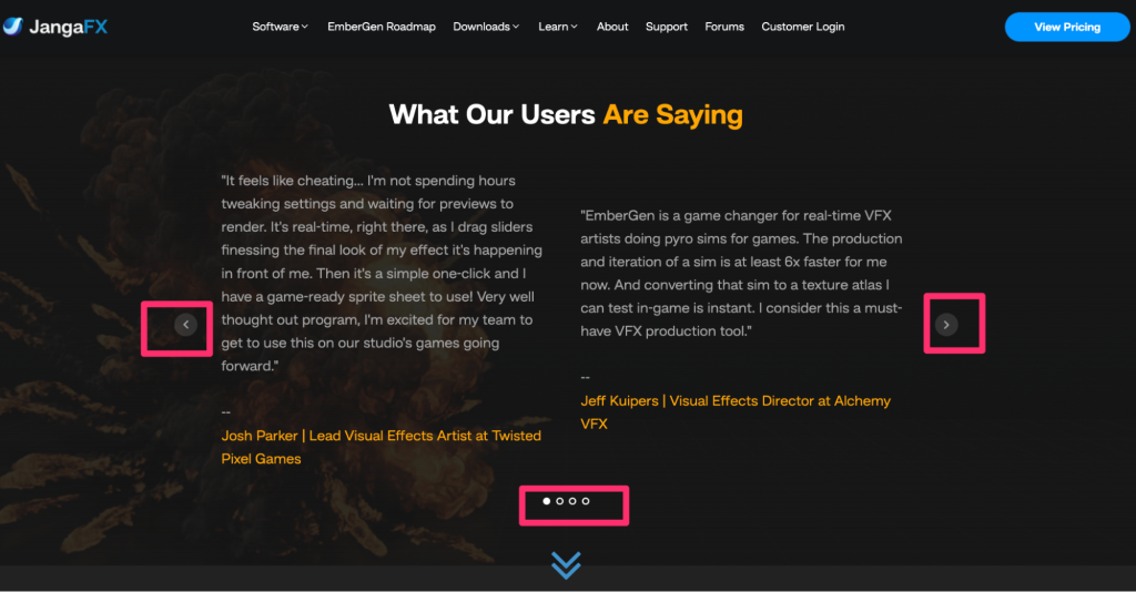
Adding testimonials is a proven strategy for increasing sales. JangaFX starts with well-written blurbs from customers. They make it easy to see that there are more testimonials to read and scroll through.
7. FlowMapp: Two ways of saving hits LTV and AOV
Finally, FlowMapp, a UX planning tool, attracts new users through its free plan.
FlowMapp’s pricing page offers two ways to upgrade and save: a promo code for half off the first three months, and an annual discount.
What we love about this strategy is that, whether users are ready to commit to an annual plan or need to stick with monthly payments, they win either way. And so does FlowMapp.
Boost your average order value (AOV) by highlighting annual payments
Annual over monthly billing means more up-front revenue you can use to grow your business.
FlowMapp makes it easy to see how much a customer will be charged and how much they’ll save when they choose the annual payments. Annual plan commitments also, ultimately increase the lifetime value (LTV) of your customers.
What pricing model is best for you?
If you don’t test, you’ll never know what’s working and what’s not.
There are products such as HotJar, UserTesting, and VWO that can help, as well as agencies that specialize in conversion rate optimization (CRO) for SaaS companies.
But if you’ve run a series of A/B tests and you’re still not happy with your conversion rate, it might be time to rethink something more foundational, such as your pricing strategy or packaging.
Here are five variables to consider as you consider your options:
SaaS pricing strategy: 5 questions to ask
1. Are you using the right value metric?
Charging per user used to be the standard for B2B SaaS businesses, but that’s changing. More SaaS companies are starting to switch to a usage-based pricing model.
“The usage-based model allows a customer to start at a low cost, minimizing friction to getting started while still preserving the ability to monetize a customer over time — because the price is directly tied with the value a customer receives,” VC Kyle Poyar explains.
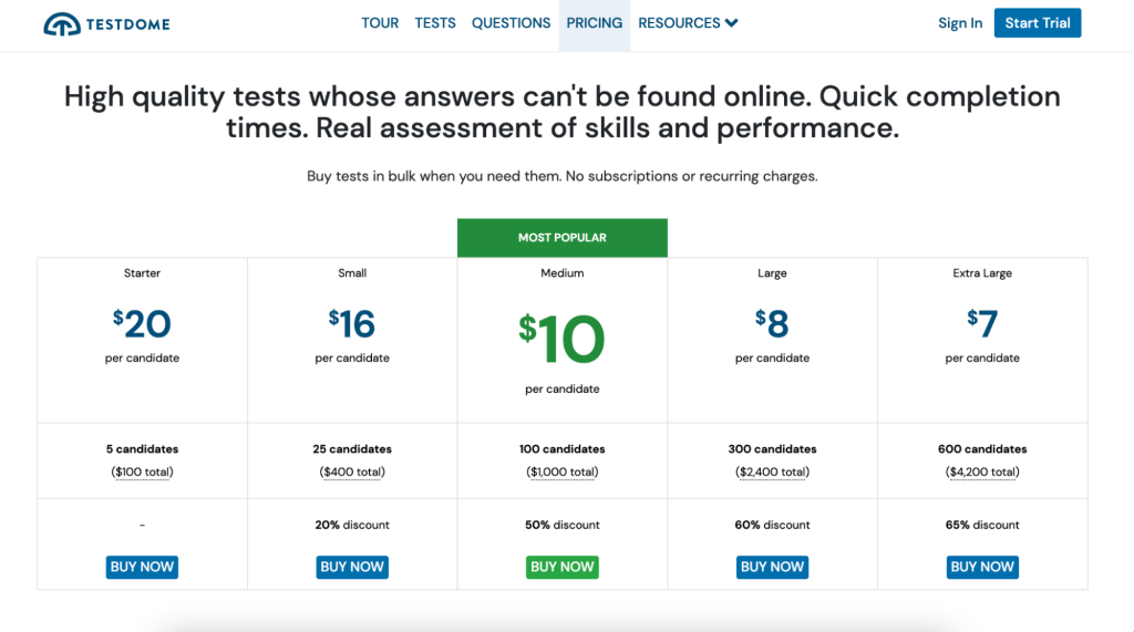
How do you know what’s right for you? In short, your pricing tiers should be based on the primary value you’re delivering through your SaaS product.
2. Are you continuously optimizing your pricing?
To create their SaaS Pricing Strategy guide, Price Intelligently surveyed 96 companies with $5 million or higher annual recurring revenue (ARR). They studied the ratio between the lifetime value (LTV) of a customer and the customer acquisition cost (CAC). Pricing Intelligently found that the companies with the most growth continuously tweaked their pricing.
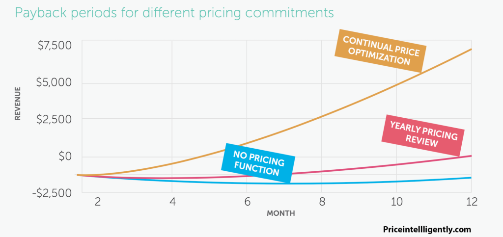
Optimizing your pricing doesn’t need to mean completely revamping the cost of your subscription plans or introducing a new pro plan. It can include creating new plan add-ons, testing out different costs associated with team sizes, adding new discounts for longer commitments, or creating new ways to customize a plan.
The leaders at Figma review their pricing and packaging every quarter: “If your pace of innovation is high, you’re likely making some kind of pricing/packaging decision every six to twelve months. There are a variety of triggers for these shifts ranging from customer response (or lack of), competitor adjustments, or changes you’re making to your own product. Taking the time to check in on a quarterly basis will keep you one step ahead of the game.”
3. Do you know which features are leaders, fillers, or killers?
Effective pricing isn’t just a number; it’s about what a user gets and doesn’t get for their money — i.e., your pricing packages.
Do you know which features in each plan are leaders, fillers, or killers? Leaders are the main features that a user wants when choosing a plan; fillers are the nice-to-have features; and killers are features that customers don’t want to pay for. Killers make someone reconsider the value of a plan.
Check out the feature evaluation matrix by Simon-Kucher to learn more.
4. Is your pricing optimized for conversions or LTV?
For many SaaS companies, attracting new customers is less important than getting more value from your existing customers. Is your pricing strategy optimized to reduce churn and create opportunities for upsells and cross-sells?
For instance, Kyle Poyar recommends not gating features that drive engagement and collaboration.
“It can be tempting to put all your new features behind a paywall or only in your Enterprise plan. But I’d urge you not to gate features that create engagement, stickiness, and collaboration. Integrations with tools like Slack or Salesforce are classic examples. These features create long-term value in the form of greater expansion revenue and reduced churn, and are items you want the majority of your customers to use.”
Are you pricing people out of features they need? Surveying lost customers is a great place to start: understanding if they canceled their subscription because of the price, missing features, or something else.
5. Is your pricing optimized for global markets?
Even if you feel confident about your pricing and packaging, if your pricing isn’t localized for specific markets, you might be missing out on growth.
According to one study, one in four shoppers abandon their purchase when their local currency isn’t offered. For major purchases, especially B2B buyers, their preferred currency may not stop a purchase. But the impression your company gives when a prospect is evaluating your product is still important.
Can they easily read your subscription tier comparison matrix? Can they easily see how a product will fit into their budget? Is VAT included in the upfront cost?
This is where we come in. FastSpring is a full-stack commerce solution that helps SaaS and software companies take payments around the world. We can localize your pricing pages and checkout experience anywhere you do business. Learn more here.
Optimize your pricing page for success
As you can see from the examples in this article, there are many ways to successfully design pricing pages and strategies.
What works best for you might be different than what works for the companies we highlighted in this article, but use what you see here as inspiration for experiments on your pricing page.
If your website is like most other SaaS websites, the pricing page is one of the most visited pages on the site.
We hope this article gave you some ideas for how to improve it.
Note: FastSpring’s dunning management and revenue recovery tools can help you reduce involuntary churn — one of the easiest ways to increase your ARR. Learn more.
![[Customer Story] Why TestDome Considers FastSpring a Real Partner](https://fastspring.com/wp-content/themes/fastspring-bamboo/images/promotional/2023/FastSpring-TestDome-blog-thumbnail.jpg)


