
Customizing Your Web Storefront
After you create a store and a web storefront , you can click the Settings button to access the configuration pages. These pages control the branding, localization, customer communication, and appearance associated with your storefront. If you have configured default settings for your Store, you can override them within the storefront settings pages below.
Edit your Storefront Settings
Customize the appearance and customer experience of your web storefront.
- Navigate to Storefronts > web storefront s.
- Click Settings on the web storefront you want to customize.
- Select a subpage to edit the associated information. Navigate to a section below to access more information.
- Save your changes.
General Settings
From the General Settings tab, you can configure settings that apply to each page on your web storefront .
Fill out following fields to customize your storefront settings:
- Store Title: Enter a title to appear as the caption for browsers. Click the language selector to display the title in additional languages.
- Favicon: Select an image file to display in the browser tab. This may also display in the browser’s address bar.
- Country and Language Selector: Select the availability of your Storefront’s country and language selector:
- Show Country/Language selector: Customers may see and change the selected language.
- Show, but lock Country/Language selector: Customers can see the selector, but they cannot change the country or language. FastSpring automatically selects the language and country based on their IP address.
- Hide Country/Language selector: The selector does not display. FastSpring automatically selects the language and country based on their IP address.
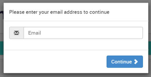
- Require email to start the order: Select True to require customers to enter their email address prior to checkout. The Store will save the email address for the remainder of the checkout process. If the checkout is abandoned, you can configure the mailingListEntry.updated webhook to display the email address for re-marketing.
- Show ‘Enter VAT ID’: True enables customers to enter their tax ID for tax exemption at checkout.
- Font: Select a font for all of the text on your storefront.
Customer Information
- Email field: Optionally display the email field in the right column of the checkout storefront in addition to the payment window.
- Newsletter Subscription Checkbox: Select the behavior of the optional opt-in checkbox labeled “Stay updated via email about product updates and special offers”:
- Show, Checked: FastSpring displays the checkbox at checkout, and selects it by default. The checkbox remains deselected for customers in areas covered by the GDPR. Customers may deselect the checkbox to opt out of the newsletter.
- Show, Unchecked: The checkbox displays deselected. The customer may select the checkbox to opt in to the newsletter.
- Hide: The checkbox does not display. Customers cannot opt in to a newsletter.
- Force physical address collection on all orders: Selecting Yes requires all customers to enter their physical address information at checkout.
- Auto / Manual subscription renewal: Select whether or not customers can opt out of automatic subscription renewals. If they opt out, the subscription becomes a Manual Renewal Subscription This does not apply to managed subscriptions.
- Do not allow customers to opt out from saving payment details: FastSpring saves the payment details using a secure token. Rebills will be processed automatically.
- Allow, Apt-Out: The subscription automatically renews by default. Customers can clear the checkbox to opt out of automatic renewals. If the checkbox remains selected, FastSpring saves the payment details to automatically process future rebills.
- Allow, Opt-In: Customers manually renew their subscriptions by default. They can select the checkbox to opt in to automatic rebills. FastSpring saves tokenized payment information only if the checkbox is selected. The customer must log in to their Account Management portal and make a payment prior to the next rebill date in order to keep the subscription.
Header Settings
Header Settings control the appearance of the section at the top of your web storefront . This applies to all pages within the storefront.
Size and Behavior Settings
- Height: Select the size of the header in pixels.
- Freeze: Select this checkbox to keep the header visible while customers scroll through your pages.
- Logo for retina screens: Upload a logo image file to appear in the header.
- Logo: Upload a logo image file to appear in the header when customers use standard displays. If you have selected a dile for retina screens above, you can leave this field blank.
- Margins around the logo: Enter (in pixels) the amount of space to include around the logo images.
- Logo link: Enter the URL that logo images direct customers to when they click on the image.
- Text: Enter text that will be displayed in the header of the Storefront, to the right of the logo. Use the language selector to enter the text in additional languages.
- Text alignment: Select whether the text in the header is aligned with the left, right, or center margin.
- Text color: Select or enter the color that the text appears in.# Links Settings
Customize how your web storefront displays hyperlinked text in the header. To customize links in the footer and body of your storefront, see Footer Settings and Page Settings below.
- Links color: Select or enter the color of all hyperlinked text in the header.
- Links color on hover: Select the color that the hyperlinked text appears when a customer hovers it with their cursor.
- Links decoration: Underline hyperlinks by default.
- Links decoration on hover: Underline hyperlinks when a customer hovers their cursor over them.
- Links style: Bolden hyperlinked text.
- Link style on hover: Bolden hyperlinked text when a customer hovers their cursor over it.
Background Settings
- Background color: Enter the header background color.
- Background image: Optionally upload an image file to serve as the header background.
- Background image ‘repeat’ property: Select from the drop-down whether the background image should be repeated horizontally, vertically, or not at all.
- Header and content separation line height: Select the pixel size of the line separating the header section from the rest of the storefront.
- Line color: Select the color of the line that separates the header from the rest of the storefront.
Footer Settings
The footer settings customize the appearance of the bottom of your web storefront , directly above the section that identifies FastSpring as the Merchant of Record. The footer is identical on every page of your storefront.
Footer Text Settings
- Color: Select or enter the color of the text in your footer.
- Text: Enter text to appear in the footer. You can add hyperlinks with markdown. Use the language drop-down to enter the message in additional languages.
Footer Links
Customize the appearance of hyperlinks in your storefront’s footer. These settings apply to the text configured in the Footer Text Settings section.
- Links color: Select or enter the color of all hyperlinked text in the footer.
- Links color on hover: Select or enter the color that the hyperlinked text appears when a customer hovers it with their cursor.
- Links decoration: Select whether or not hyperlinks in the header are underlined.
- Links decoration on hover: Underline hyperlinks when a customer hovers their cursor over them.
- Links style: Bolden hyperlinks.
- Link style on hover: Bolden hyperlinks when a customer hovers their cursor over it.
- Background color: Select or enter the main color of the footer on each page.
Page Settings
Customize the style of content in the body of your web storefront pages. This includes all content in between the header and footer.
Links on Pages
Customize the appearance of hyperlinks on each web storefront page.
- Content links color: Select or enter the color of all hyperlinked text in the header.
- Content links color on hover: Select or enter the color that the hyperlinked text appears when a customer hovers it with their cursor.
- Content links decoration: Underline hyperlinks.
- Content links decoration on hover: Underline hyperlinks when a customer hovers their cursor over them.
- Content links font weight: Bolden hyperlinked text.
- Content links decoration on hover: Bolden hyperlinked text when a customer hovers their cursor over it.
- Tax Text Color: Enter the color of text that displays tax information.
Background
Customize the background of your page, in between the header and footer of your web storefront .
- Background color: Select the color that appears behind your product and pricing information.
- Background image: Upload an image file to serve as the background of each page. Adjust the following fields:
- Background image ‘repeat’ property: Select whether the background image should be repeated horizontally, vertically, or not at all.
- Background image ‘size’ property: Use CSS values to control the size of the background image, if selected.
- Background image ‘position’ property: Control whether the background image remains in a fixed position or moves when a customer scrolls.
- Background image ‘attachment’ property: Control whether the background image remains in a fixed position or moves when a customer scrolls.
- Background image ‘clip’ property: Control the background-clip CSS property of the image.
- Color of the group title: Select or enter the color of the heading text in product offers.
- Panel corders radius: Adjust the roundness of the corners on your page. Higher values apply rounder corners.
- Popup windows corner radius: Adjust the roundness of the corners on your popup window. Higher values apply rounder corners.
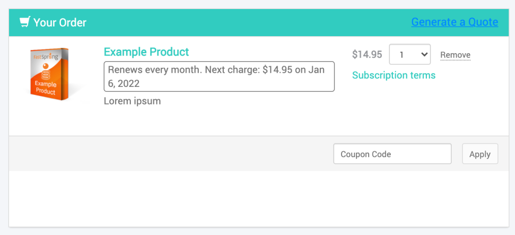
- Panel and group display title alignment: Select whether the panel titles align with the left, right, or center margin. Panel titles include: “Your Order” on the product page and “Your Payment” above the payment methods on the right panel.
- Panel headers background color: Select the background color of panel headers. Panel headers include “Your Order” on the product page, and “Your Payment” above the payment methods on the right panel.
- Panel headers text color: Select or enter the color of the panel header text.
- Text Color: Select the color in which FastSpring terms and conditions display below your footer.
Products and Prices
Customize the sizing of product titles and icons, and the color of product prices on your web storefront .
Price
- Color: Select or enter the color in which product prices appear.
- Size: Adjust the size of your product price.
- Product options price display configuration: Select whether or not free products are labeled “FREE” in your Storefront.
Products
- Product title size: Select the font size (in pixels) for product titles in the following sections: homepage, secondary homepage, main product page. This does not apply to product offers.
- Product image size: Select the size (in pixels) to apply to product icons in the following sections: homepage, secondary homepage, main product page.
cmp79229
Products as Offers
Customize the display of product offers on your web storefront .
- Offer title size: Select the font size (in pixels) of the product title.
- Offer image size outside the cart: Select the size of product icons that appear with a product offer after a customer selects it.
- Offer image size within the cart: Select the size of product icons that appear with a product offer before a customer selects it.
Homepage
Customize the appearance and behavior of elements and features on your storefront’s homepage.
- Show checkboxes for adding products to the cart: Display a checkbox to the left of products in your product catalog. When a customer selects the checkbox, FastSpring adds the product to their cart.
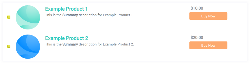
- Product action button behavior: Select the behavior of product action buttons. These buttons appear to the right of the product and include customizable text, such as “Buy Now”. The selected behavior applies to all products on the homepage.
- Adds product to cart: Adds the product to the customer’s cart. The customer remains on the homepage with “Your Payment” displaying on the right.
- Opens product page: Opens the associated product details page, and adds the product to the cart.
- Hidden: Remove the action buttons. Only product prices display to the right of the product.
- Product title link behavior: Select the behavior when a customer clicks on a product title:
- Open product checkout page: Opens the associated product details page, and adds the product to the cart.
- Show inline product description: Triggers a popup window which displays the product’s icon and the contents of the long description field.
Buttons
Customize the appearance of buttons on your web storefront .
Example:

Corner Radius = 8px
Border Width = 3px
Border Color = rgb(0,0,0)(black)
- Corner radius: Adjust the roundness of the buttons’ corners. Higher pixels result in rounder corners.
- Color: Select or enter the primary colors of your buttons. This can vary by type of button.
- Color on Hover: Select or enter the color to which buttons change when a customer hovers their cursor over them.
- Text size: Select the size (in pixels) of the text that appears on the button. Higher values result in larger text.
- Text color: Select or enter the primary color of the text that appears on the button.
- Text color on hover: Select or enter the color to which the text changes when a customer hovers their cursor over the button.
- Border width: Select the size (in pixels) of the button’s border. Higher values result in thicker borders.
- Border color: If you increase the border width, select the primary color of the button’s border.
- Border color on hover: If you increase the border width, select the color to which the border changes when a customer hovers their cursor over the button.
Types of Buttons
- Payment: Control the user experience when a customer is ready to pay for their product. If you select the Short Checkout Flow checkbox, customers may also initiate the checkout flow by selecting their payment method to the right of the product catalog.
- Add to Cart: Appear to the right of the product in the product catalog. Customers click these to add or remove a product from their cart. You can customize the text in the “Call to Action” field of the product’s configuration page.
- Cross-Sell: Action buttons associated with cross-sell offers. You can customize the text in the “Call to Action” field of the product’s configuration page.
- Up-Sell: Action buttons associated with upsell offers. You can customize the text in the “Call to Action” field of the product’s configuration page.
- ‘Download Now’ and ‘View Instructions’: Appear on the completion page after a successful purchase. Customers can click these buttons to receive their fulfillments, or instructions for getting started with your product.
- Manage Subscription: Appear in the customer’s Account Management portal. Customers can pause, cancel, resume, and upgrade subscriptions, depending on your store’s configuration.
- Manage Your Orders Links in customer notifications target your default web storefront: If you want to customize those settings, make sure the links are associated with the default storefront, and apply the changes there.
- Subscription ‘Use Payment Method’: When a customer adds a new payment method in their Account Management portal, they can click Use This to change the payment details of an active subscription. This section controls the appearance of that button.
- Add Payment Method Button: Displays on the Account Details and Payment Methods tab of the Account Management site. Customers click this button to input new card details for existing subscriptions.
- Save Payment Details: After a customer adds a new payment method in the Account Management site, this button appears.
- Manage Payment Method: Customers may click Manage in their Account Management portal to pause, cancel, or upgrade existing subscriptions, depending on their configuration. This button appears next to each payment method on the Account Details and Payment Methods tab.
- Confirm Dialog OK: Appears on confirmation pages when a customer makes changes to their existing subscriptions via the Manage button.
- Confirm Dialog Cancel: Appears on confirmation pages when a customer makes changes to their existing subscriptions via the Manage button.
Completion Page
The Enable licenses on completion page checkbox controls whether or not configured fulfillments appear on the Completion page following a successful purchase.
Customers can also access their fulfillments through their receipt emails or their account management portal
Promotions
Customize the behavior of your web storefront ’s promotional features. This includes promotional codes, cross-sells, upsells, and popup offers when a customer does not make a purchase immediately.
Promotional Code
Customize the behavior of the coupon code field at checkout. If displayed, customers can input coupon codes that you configure to receive a discount at checkout.
- Show ‘Promotional Code’ field: Select the placement of the coupon code field:
- Show: The coupon code field appears below the products in the homepage, product page and cart page (displayed above).
- Hide: The coupon code field does not appear in the web storefront . Customers cannot enter promotional codes, however you can apply them from the Store Builder Library, FastSpring API, or by creating a Custom Order.
- Show in ‘Your Payment’ Block: The coupon code field appears in the ‘Your Payment’ block.
- ‘Promotional Code’ display type: If you configure the promotional code field to display on your web storefront , select the conditions in which it displays:
- Display coupon fields right away: The coupon code field appears when the web storefront loads.
- Display ‘Enter coupon code’ link which exposes coupon field when clicked: An “Enter Promotional Code” link appears below the products. Customers click the link to access the coupon code field.
Product Page
Customize the positioning of cross-sell and upsell offers in the product catalog. This placement is in relation to the products which trigger the offers.
- Storefront level Сross-sell offers position: Control how FastSpring displays the Extended Download Service This setting does not apply to standard cross-sell offers.
- Cross-sell offers position: Control where cross-sells display in reference to the product that initiates the promotion.
- Where up-sell offers are displayed: Control where upsells appear: on the product page, on a popup window, or both.
- Up-sell offers position on the page: Control the location of upsell offers. If you select to display an up-sell offer on a popup window above, the upsell will appear in the popup instead of this setting, by default.
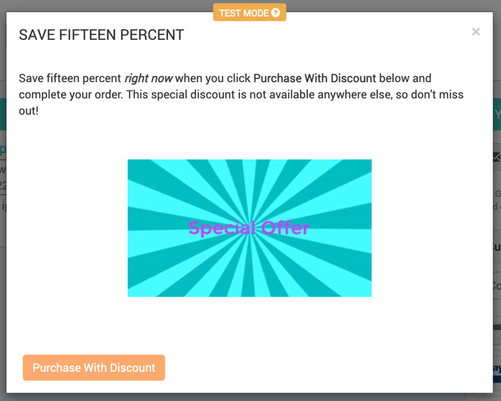
Abandoned Cart Popup
If you plan to use a cart abandonment popup dialog, you can control the appearance in this section. This will display when a customer leaves the page open in their browser without completing a purchase. This only appears if there are items in the cart.
- Popup displayed when visitor attempts to leave page: If enabled, the browser’s built-in warning appears when the customer attempts to close the page. If the customer stays on the page, the Popup dialog appears.
- Popup displayed when no visitor activity detected: If enabled, the popup appears after a configured amount of time with no activity from the customer.
- Display timeout: Control the number of minutes of no activity that triggers the popup. Click the language drop-down to apply different timeouts for specific regions.
- Popup Title: Enter the title to be used at the top of the Abandoned Cart Popup. Use the language selector to enter it in additional languages.
- Popup Text: Enter the message that appears in the Abandoned Cart Popup. Use the language selector to enter it in additional languages.
- Coupon to be offered to complete the purchase: Optionally apply an existing coupons code to offer customers a discount when the popup appears. Use the language selector to enter it in additional languages.
- Popup heading alignment: Select the alignment of the heading text.
- Popup text alignment: Select the alignment of the main message.
- Popup bottom alignment: Select the alignment of the action button at the bottom of the popup.
- Popup image: Select an image file that will display at the center of the popup.
Analytics Integration
Customize the integration between your web storefront and your Google Analytics account.
Google Analytics
- Use default Google Analytics property ID from integration settings: The web storefront uses the default Google Analytics property ID.
- Use custom Google Analytics property ID for this storefront: Specify a custom property ID in the field below. This will be used by the web storefront .
- Do not enable Google Analytics for this storefront: Disable Google Analytics tracking for all activity on this web storefront .
- Custom Google Analytics property ID for this storefront: Enter a Google Analytics property ID to be used by this web storefront . This only applies if you are using the Google Analytics property ID.
Google Tag Manager Integration Behavior
- Use default Google Tag Manager container ID from integration settings: The web storefront uses the default Google Tag Manager container ID.
- Use custom Google Tag Manager container ID for this storefront: Specify a custom container ID in the field below. This will be used by the web storefront .
- Do not run Google Tag Manager for this storefront: Disable the Google Tag Manager integration for this web storefront .
- Google Tag Manager custom container ID for this storefront: Enter a container ID to be used by this web storefront . This only applies if you are using the Google Analytics property ID.
Checkout
If you enable gift purchases in your store, you can select Enable Gift Purchases to allow customers to purchase on behalf of a recipient in this Storefront.
PayPal
The PayPal subpage lets you customize the PayPal logon window that appears when a customer chooses to pay with PayPal.
- Checkout Brand Logo: Select an image file to appear at the top of the PayPal login window.
- Checkout Brand Title: Enter a brand title to appear in the PayPal login window. You can link this logo to the web storefront . Use the language code selector to enter the title in each language.
Updated about 2 months ago